Why Your All-One-Color Outfit Reads Flat in Photos
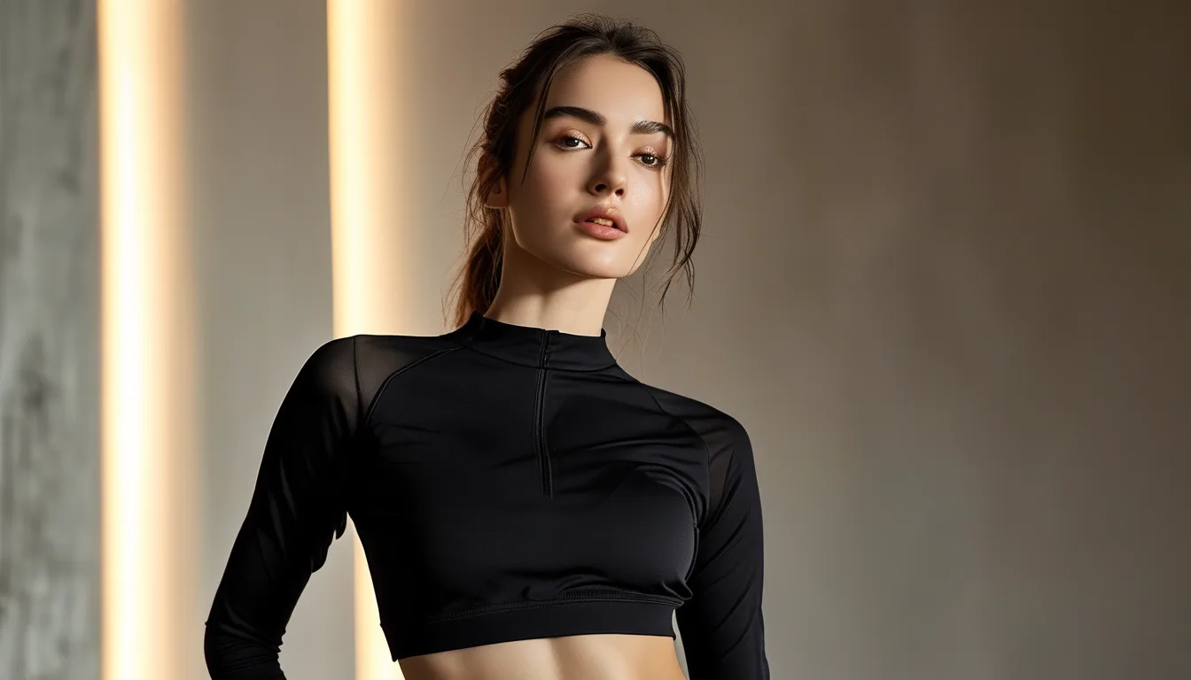
Quick Answer: Monochrome outfits fall flat on camera because cameras compress tonal range, erasing the subtle shadow differences your eye uses to separate garments. Fix it with texture contrast — mix ribbed with smooth, matte with slight sheen — and vary the tone by two or three shades within the same color family rather than matching exactly.
In the mirror, it looked expensive. Long, clean, deliberate.
In the photo your friend took, it is a shapeless column with your head on top.
This is not a body issue or a lighting issue in the usual sense. It is a specific and predictable thing that happens when cameras encounter a single tone, and once you know the mechanism, the fix is straightforward.
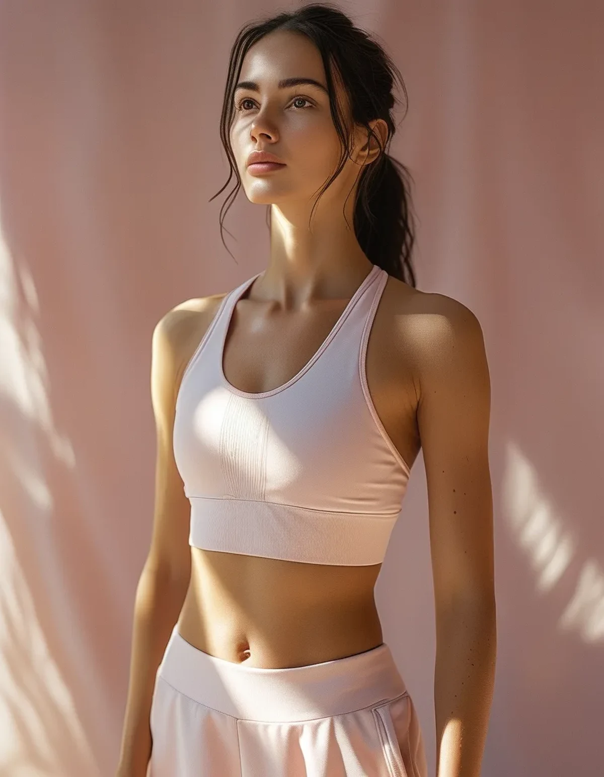
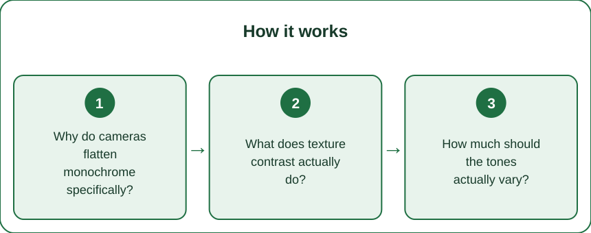
Why do cameras flatten monochrome specifically?
Because they compress dynamic range, and monochrome outfits depend entirely on the part that gets compressed.
Your eye handles a far wider range of brightness than any camera sensor — roughly 20 stops versus 12 to 14 on a good phone. When you look at an all-black outfit in person, you perceive the subtle shadow differences between the jacket, the top, and the leggings. The camera collapses those into one value.
The result is a silhouette rather than an outfit. Everything below the neck becomes a single shape.
Three things make it worse:
- Automatic exposure. The camera meters for the overall scene, and a large block of one tone pulls the exposure, further reducing detail within it.
- Compression. Photos posted to social platforms are compressed heavily, and compression algorithms discard exactly the subtle tonal variation you needed.
- Flat, even lighting. Overcast days and indoor diffuse light remove the shadows that would have separated the pieces.
The good news: the fix does not require better lighting or a better camera. It requires giving the camera something it can actually record.
What does texture contrast actually do?
It creates micro-shadows that survive compression, which is what separates one garment from the next.
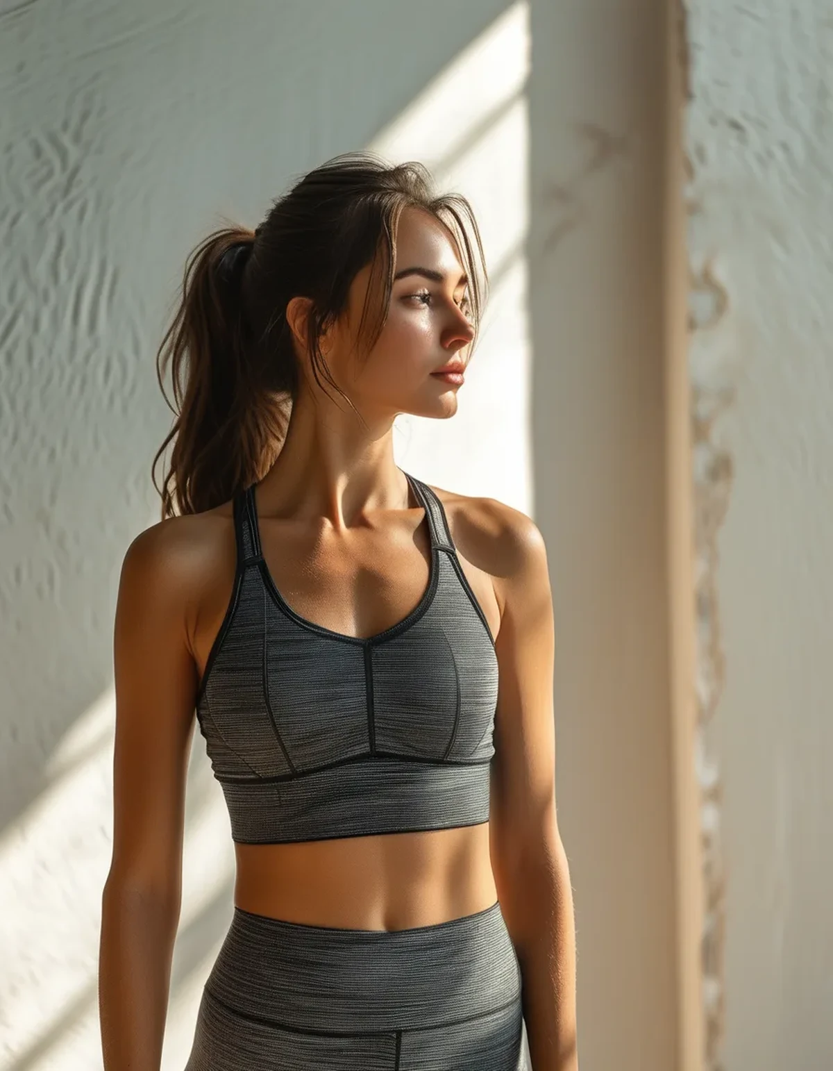
Different textures reflect light differently even in the exact same color. A ribbed knit has hundreds of tiny highlights and shadows. A smooth technical fabric has a continuous even surface. Put them next to each other and the camera registers a clear boundary, even at identical color values.
Combinations that photograph well:
- Ribbed with smooth. The most reliable pairing and the easiest to source. A ribbed top with smooth leggings, or the reverse.
- Matte with slight sheen. A matte cotton-feel top with a lightly lustrous legging reads as deliberate and distinctly layered.
- Chunky knit with fine knit. Excellent in cooler weather, and the scale difference is visible even in small photos.
- Anything with visible seaming. Panel lines, contrast stitching in the same color, princess seams — these all create structural lines the camera catches.
Texture is the entire reason expensive monochrome looks expensive. It is rarely the color. It is that the pieces were chosen to have different surfaces.
How much should the tones actually vary?
Two to three shades apart within one family — close enough to read as one color, far enough to separate.
Exact matching is the most common mistake, and it is also usually impossible: two garments dyed in different batches almost never match precisely, so the choice is between an accidental near-match that looks like a mistake and a deliberate variation that looks intentional.
Deliberate beats accidental every time.
Practical tonal recipes:
- Charcoal top, black bottom. Reads as black overall, photographs with clear separation.
- Cream top, oatmeal bottom. Softer and considerably more forgiving than matching white.
- Olive top, deep forest bottom. The gradient reads as intentional depth.
- Darker on the bottom, lighter on top, generally. This grounds the outfit and draws the eye upward, and it photographs better than the reverse in most lighting.
One caution: greys are the hardest family to do this in. Grey carries undertones — blue, green, brown — that are invisible in person and obvious on camera. If you are working in grey, check the pieces together in a photo before committing, not just in the mirror.
Myth vs Fact: Monochrome Edition
Myth: All-black is universally slimming. Fact: Black eliminates shape information entirely, which sometimes reads as slimmer and sometimes reads as a shapeless block, depending on the silhouette. Structure and fit determine the outcome far more than the color does.
Myth: Monochrome means everything must match exactly. Fact: Tonal dressing — several shades of one family — is both easier to execute and better looking than exact matching. Exact matching is a synthetic-fiber-era idea that rarely flatters.
Myth: Adding a belt or accessory fixes flatness. Fact: A contrasting accessory breaks the column, which helps, but it does not solve the underlying problem — the garments still merge into each other. Texture solves it at the source.
Myth: Monochrome only works in neutrals. Fact: Tonal dressing in a saturated color is striking, and it photographs better than neutrals because saturated colors retain more distinction under compression.
Myth: Photos just do not do it justice. Fact: They accurately record what a camera can capture. If an outfit only works in person, it is relying on tonal subtlety that no camera will ever preserve — which is a design choice, not a photography failure.
How do you build a monochrome look that works everywhere?
Five checks before you leave the house:
1. Two textures minimum. Run your hand over both pieces. If they feel the same, the camera will read them as the same.
2. Two to three shades of tonal difference. Hold the pieces together in natural light. If they are near-identical, swap one.
3. One structural line. A visible waistband, a defined shoulder seam, a jacket edge, a hem that lands somewhere meaningful. This gives the eye a place to stop and prevents the column effect.
4. Something at the extremities in a different value. Shoes, a hair tie, socks that show, a bag. It does not need to contrast in color — a different lightness within the same family is enough.
5. Take one test photo. Thirty seconds, and it tells you everything. What you see in the photo is what everyone else will see.
The counterintuitive part is that monochrome is a harder outfit to execute than a mixed one, despite looking simpler. A mixed outfit has built-in separation. A monochrome one has to manufacture it, which is precisely why the well-executed version looks so intentional.
FAQ: Monochrome Questions, Answered
Does this apply to video too?
More so. Video compresses even more aggressively than still images, and motion blur further reduces detail. Texture contrast is the only reliable thing that survives, which is why it matters most for anything you plan to film.
What is the easiest monochrome combination to start with?
Charcoal and black with one ribbed piece. It is forgiving, it works in most lighting, and the tonal difference is enough to separate without looking like a mismatch.
Should I avoid monochrome for photos entirely?
Not at all — well-executed monochrome photographs beautifully and reads as more considered than a mixed outfit. It just requires the texture and tone decisions to be made deliberately rather than assumed.
TL;DR:
- Cameras compress tonal range and erase the subtle shadows that separate matching pieces.
- Texture contrast — ribbed with smooth, matte with sheen — is the fix that survives compression.
- Vary tone by two to three shades within one family; exact matching reads as accidental.
- Add one structural line and one different value at the extremities to break the column.
- Take a test photo before you leave. It shows you what everyone else will see.
The nice part is that none of this requires new clothes. Most people already own the ribbed piece and the smooth piece — they have just been pairing smooth with smooth and wondering why the result looked like a shadow.
See It in Motion
Seen here: Super High Waist Embossed Yoga Leggings with Inner Pocket — shop it on bubblelime.com
Keep Reading
This article is for general informational and styling purposes only. Fit, sizing, and product availability may vary.