Why Fabric Sheen Decides If Two Same Color Pieces Read as One Outfit

Quick Answer: Two pieces in an identical colour can look mismatched because of sheen, the amount of light a surface reflects directly rather than scattering. A matte knit and a satin-faced fabric in the same black read as two different depths of black, because the shiny one bounces light back to your eye and reads lighter. Matching sheen makes a monochrome outfit read as one garment. Deliberately contrasting it, in a controlled way, is what stops the outfit looking flat.
You checked the colour against a window. It matched. You put both pieces on and something is still off.
The issue is not which black. It is how each surface handles light, and once you can see it you cannot unsee it.

What is sheen and why does it change perceived colour?
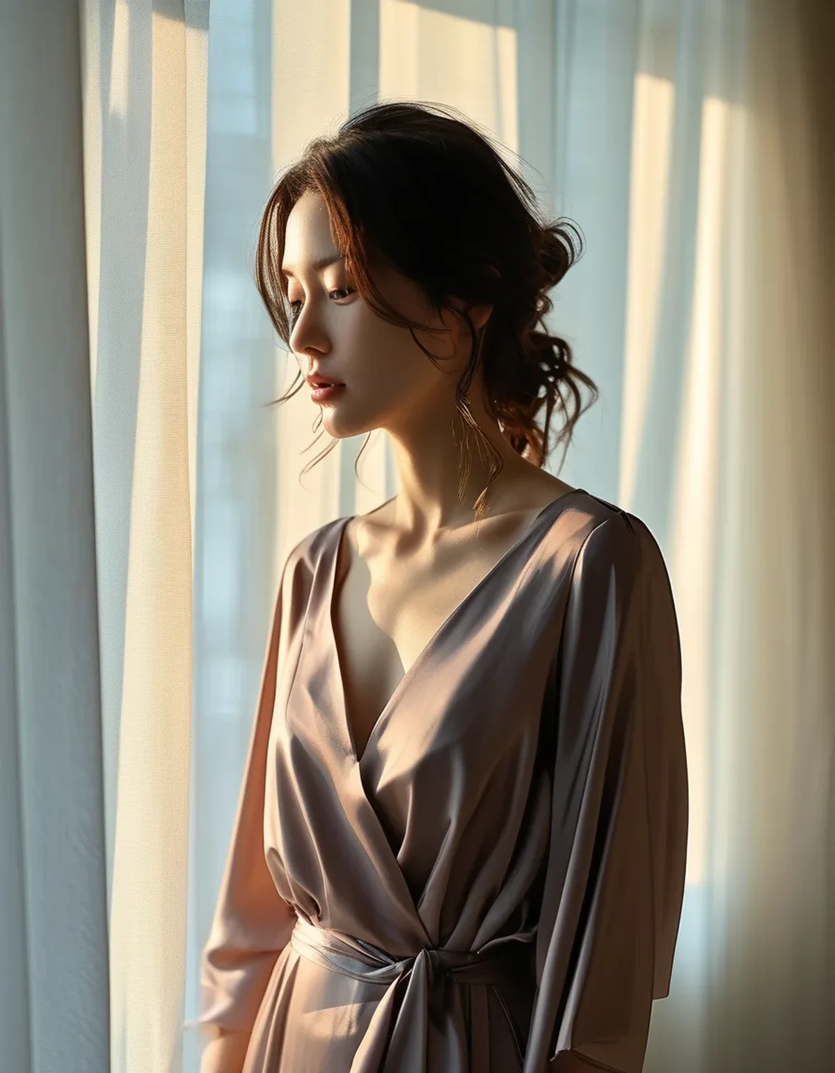
Sheen, or lustre, describes how much light a surface reflects specularly, meaning at a mirror angle, versus how much it scatters diffusely in every direction.
A matte surface scatters. Almost no light comes straight back to your eye, so you perceive the fabric’s actual pigment, which reads deep and saturated.
A shiny surface reflects. Some of what reaches your eye is the light source rather than the fabric, which mixes white into your perception. The colour reads lighter, and in the case of black, greyer.
This is why the same dye on two different fabrics can look like two different colours. The dye is identical. The optics are not.
What drives it: fibre type, since nylon and polyester are naturally more lustrous than cotton; yarn structure, since smooth filament yarns shine and spun staple yarns do not; knit or weave structure, with satin weaves and interlock knits reflecting more than jersey; and finishing, since brushed and peached finishes kill sheen and calendering adds it.
Where does this show up in activewear specifically?
In three combinations that come up constantly.
Nylon-elastane leggings with a cotton-blend top. The leggings are smooth and slightly lustrous. The top is matte. In the same black, the leggings read lighter and slightly cool, the top reads deeper and warmer. This is the single most common tonal outfit mismatch.
A sports bra under a mesh or sheer panel. Mesh scatters differently from the solid fabric around it, so a black mesh insert reads as a different black even when it comes from the same roll.
A shell jacket over anything. Technical shells are coated or tightly woven and often quite shiny. Over a matte fleece or knit, the jacket looks like a different colour family altogether, and this becomes the dominant styling problem the moment the weather turns and jackets come back into daily use.
Compression versus relaxed fabrics also differ, because stretched fabric has a flatter surface with fewer scattering angles, so a compressive legging reads shinier than the same fabric relaxed.
Does this affect colours other than black?
Yes, and often more visibly. Deep colours like navy, forest and burgundy show sheen differences strongly. Very pale colours hide them well, because there is less contrast between the pigment and the reflected light.
Myth vs Fact: tonal dressing
Myth: A monochrome outfit needs the exact same colour throughout. Fact: Exact matching often looks worse, because sheen differences then read as errors rather than choices. A deliberate small shift in value is easier to carry than a near-match that is slightly off.
Myth: All-matte is the safe option. Fact: Safe, and frequently flat. An entirely matte outfit in one colour absorbs light everywhere and loses all definition in photographs, which is the flatness people complain about.
Myth: Shine looks cheap. Fact: Uncontrolled shine looks cheap. A single deliberate lustrous piece against matte reads as intentional and expensive. It is contrast that does it, not the presence of sheen.
Myth: You can judge sheen in a photo. Fact: Product photography is lit specifically to flatter fabric surfaces, and phone processing alters highlights heavily. Sheen is one of the properties least reliably conveyed online.
Myth: Sheen is fixed for the life of the garment. Fact: It changes. Pilling and abrasion increase scattering and reduce sheen over time, which is why an old legging looks duller than a new one in the same colour. This is a real cause of a set drifting apart visually.
How do I use sheen deliberately?
Three approaches, all of which work better than trying to match everything perfectly.
Match sheen, vary texture. Two matte pieces with different surface textures, a ribbed top and a smooth legging, reads as one cohesive outfit with visual interest. This is the most reliable formula.
One lustrous piece, everything else matte. The shiny piece becomes the focal point. A satin-faced jacket or a glossy legging with matte everything else looks composed. Two shiny pieces plus matte in the middle looks accidental, so keep it to one.
Graduate the sheen deliberately. Matte at the bottom, slightly more lustrous at the top, draws the eye upward. This is an old tailoring idea and it works in activewear too.
What to avoid: near-identical sheen that is not quite identical. Two nearly-matte fabrics where one is fractionally shinier is the combination that reads as a mistake, because the eye detects the difference but cannot categorise it as intentional.
How do I check before buying?
Hold both pieces at an angle to a window so light glances across them, rather than facing the light directly. Specular reflection only shows at an angle, so a straight-on look will hide it completely.
What about fall layering, where this gets harder?
Autumn is where sheen mismatches become most obvious, for a specific reason.
Outerwear is where the shiny fabrics live. Technical shells, puffers, coated finishes. The moment a jacket goes over a tonal outfit, you have introduced the highest-sheen item in the whole outfit at the largest surface area.
Light quality changes too. Lower autumn sun sits at a shallower angle, which means more glancing light and therefore more visible specular reflection than in high summer. Outfits that read as cohesive in June read as mismatched in October without anything changing.
The practical approaches:
- Choose a matte outer layer if the rest of the outfit is matte. Soft shell, brushed fleece and wool-blend all keep the tonal read intact.
- Or accept the jacket as the deliberate contrast piece and keep everything under it consistently matte. This is the cleaner solution and it works with the shells most people already own.
- Watch the middle layer. A shiny mid layer under a shiny shell produces two competing highlights and looks busy.
- Consider value rather than sheen for the outer piece. A jacket a shade lighter or darker than the base outfit sidesteps the whole problem, since a deliberate value break reads as intentional in a way a sheen mismatch never does.
And the maintenance note: do not dry synthetics on high heat. It flattens and glazes fibre surfaces unevenly, which changes sheen in patches and is the most common reason one piece of a set stops matching the other.
FAQ: Monochrome and Sheen Questions, Answered
Does this apply to accessories too?
Strongly. A patent shoe or a coated bag against a matte outfit is a large sheen contrast in a small area, which is usually flattering because it functions as a deliberate accent.
Why do my outfits look better in some rooms than others?
Directional light, like a single window or a spotlight, exaggerates sheen. Diffuse light, like an overcast day or a room with several soft sources, minimises it. The outfit did not change.
Is heather or marl fabric a solution?
Often, yes. Mixed-fibre heathers scatter light irregularly, which hides both sheen and small colour differences. It is why heather grey sets stay looking coordinated longer than solid ones.
Can I reduce sheen on a garment?
Washing inside out with a gentle detergent and air drying preserves the original finish. There is no reliable way to remove sheen from a lustrous fabric without damaging it.
TL;DR:
- Sheen, not colour, is usually why two same-coloured pieces do not read as one outfit. Shiny surfaces reflect light and read lighter.
- It comes from fibre, yarn, knit structure and finish, so identical dye on different fabrics looks different.
- Match sheen and vary texture for cohesion, or use one lustrous piece against matte for a deliberate focal point.
- Near-identical-but-not-quite sheen is the combination that reads as a mistake.
- Autumn makes it worse through shiny outerwear and low-angle light. Choose a matte outer, or let the jacket be the deliberate contrast.
Check fabrics at a glancing angle to a window rather than face-on. Every sheen difference you will ever notice in daylight shows up in that one test.
See It in Motion
Seen here: High Waist 8” Yoga Shorts — shop similar styles on bubblelime.com
Keep Reading
This article is for general informational and styling purposes only. Fit, sizing, and product availability may vary.