Why Visible Logos Break a Monochrome Outfit and How to Work Around Them
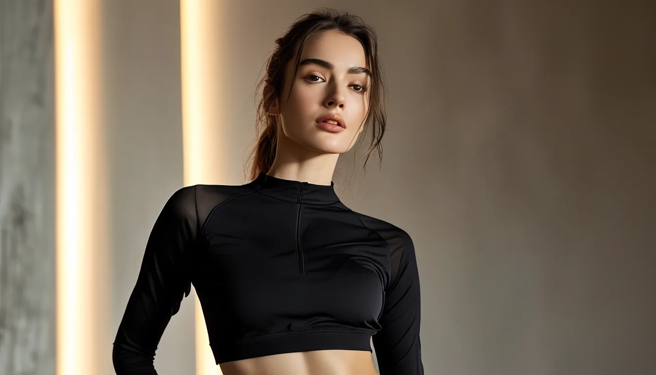
Quick Answer: A monochrome outfit works by creating one continuous vertical line, and a high-contrast logo breaks that line at whatever height it sits — usually mid-thigh or chest, both of which visually shorten the body. Tonal logos in the same color as the fabric are fine. If your favorite pieces have contrast branding, place them so the marks sit at the same height on both sides, or use a layer to cover one of them.
This is the most common reason a monochrome outfit that should look sleek reads as merely matching. The color is right and the effect is missing, and the difference is almost always three inches of white embroidery.
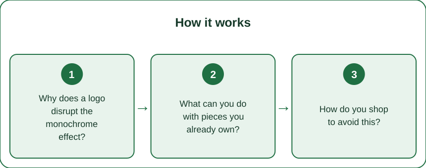
Why does a logo disrupt the monochrome effect?
Because the whole mechanism of monochrome dressing is uninterrupted continuity.
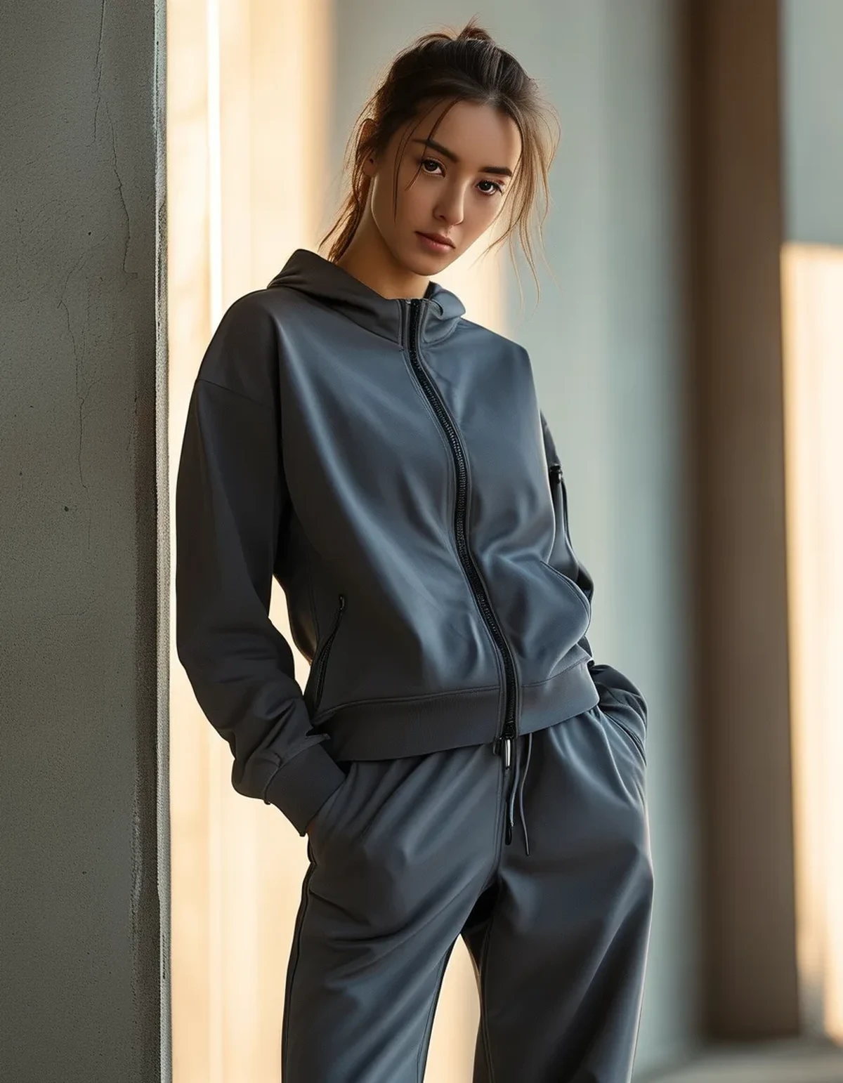
When an outfit is one color from shoulder to ankle, the eye travels the full length without stopping. That unbroken travel is what reads as elongating and, to most viewers, as expensive. It is the same principle behind a column dress.
A high-contrast mark stops the eye. It creates a horizontal reference point at whatever height it sits, and the eye now reads the body as two segments rather than one line. A logo at mid-thigh effectively splits your leg length in the viewer’s perception.
The damage scales with contrast, not with size. A small bright white logo on black does considerably more disruption than a large tonal grey one on charcoal. Reflective silver details are the worst offenders because they change appearance with the light and catch the eye repeatedly.
Placement matters too. A logo at the ankle or the upper chest is far less disruptive than one at mid-thigh or waist, because those are already natural stopping points.
What can you do with pieces you already own?
Four approaches, roughly in order of effort.
Layer over it. An open jacket or an overshirt hides a chest logo entirely and covers most waist ones. This is free and works immediately.
Balance rather than hide. If your legging has a logo on one thigh, a top with a logo at a similar height creates a deliberate-looking rhythm rather than a random interruption. Two marks read as design; one reads as a distraction.
Reposition how it sits. Some logos land at different heights depending on rise and hem. High-rise wear pulls a thigh logo upward toward the hip, which is a less disruptive position than mid-thigh.
Wear it out on purpose. A well-worn logo fades. This is not a strategy for new pieces, but it is worth knowing that the printed rubber ones lose contrast substantially after 30 or 40 washes.
What not to do: attempt to remove a heat-pressed logo with a home method. You will damage the fabric far more visibly than the logo ever did, and technical fabrics are particularly unforgiving.
How do you shop to avoid this?
Three filters when buying.
Look for tonal branding. Many brands now offer the same style with either a contrast or a tonal logo, often at the same price. Product photos show this clearly, and the tonal version is the more versatile purchase every time.
Check the seam colors. A black legging with white stitching is effectively a logo running the full length of your leg. Contrast topstitching is a design detail that completely undermines monochrome dressing, and it appears on more pieces than people notice.
Check the waistband interior. Many pieces have a printed logo on the inside of the waistband that becomes visible when the band folds or when worn under a cropped top. Fine most of the time, worth knowing about.
One useful heuristic: the more expensive the piece, the more likely the branding is subtle — which is a stylistic convention rather than a rule about quality. Plenty of mid-price pieces have discreet branding if you filter for it.
What Nobody Tells You About Monochrome Dressing
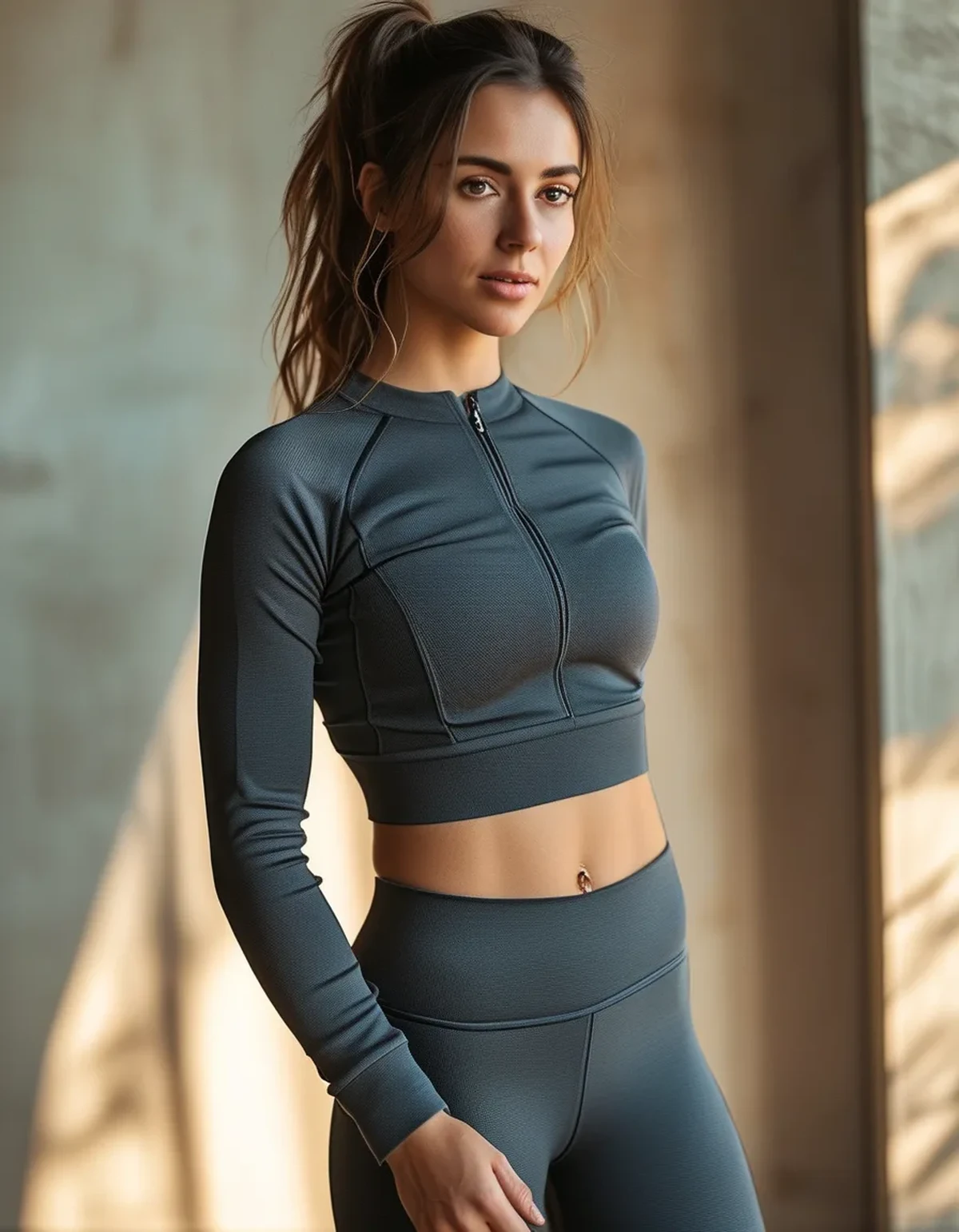
The color is the easy part. Texture is what separates a monochrome outfit that looks considered from one that looks flat.
When everything is the same color, the eye needs something else to read, and texture is what fills that role — a ribbed knit against a smooth compression fabric, a matte legging with a slightly sheeny jacket. Without texture variation, monochrome reads as a uniform rather than an outfit, which is fine at the gym and less so anywhere else.
Second thing: the shades will never match perfectly across brands, and chasing an exact match is a losing game. Two blacks from different labels will read as slightly different in daylight no matter what. The fix is embracing it as tonal dressing rather than pretending it is identical — a deliberate charcoal-with-black combination looks intentional in a way that a near-miss black does not.
Third: monochrome amplifies fit. With no color breaks to distract, every wrinkle, every waistband roll, and every ill-fitting seam becomes the most visible thing in the outfit. Monochrome demands better fit than color blocking does.
And fourth — logos on shoes count. An otherwise flawless all-black outfit with a brightly branded sneaker has the same interruption problem at the very bottom of the line, where it truncates the leg.
How does this change with fall layering?
More pieces means more opportunities for interruption, and more opportunities to fix it.
Adding a jacket introduces a second logo position, a zip pull, and often contrast trim at the cuffs. Check the full stack in a mirror before deciding it works — three pieces that each look clean individually can total five visible marks.
The upside is coverage. A long-line jacket or a longer knit conceals thigh logos entirely, which means pieces you avoid in summer become perfectly usable in October.
Outerwear also gives you a natural place to break the monochrome intentionally. A single deliberate contrast — a camel coat over an all-black base — reads far better than an accidental logo, because it is a large clear shape rather than a small competing detail.
And as fabrics get heavier this season, texture variation becomes easier to achieve. A wool-blend layer over a smooth technical base is the simplest way to make monochrome look deliberate, and it happens naturally with seasonal dressing.
FAQ: Monochrome and Logo Questions, Answered
Do small logos really matter that much?
Contrast matters more than size. A one-inch bright white logo on black interrupts more than a four-inch tonal one. If you squint at your reflection and the mark is still the first thing you see, it is affecting the outfit.
Can I cover a logo with fabric paint or patches?
Fabric paint on stretch technical material cracks within a few washes and looks worse than the logo did. A well-chosen iron-on patch can work on a woven jacket but not on performance knits, where the heat damages the fibers.
Is tonal branding always better?
For monochrome dressing, yes. For a colorblocked or casual outfit, contrast branding is a design element and can work well. The rule is specific to one-color dressing, where continuity is the entire point.
TL;DR:
- Monochrome works through an unbroken line, and a contrast logo creates a horizontal break that visually shortens the body.
- Contrast level matters more than logo size — small and bright is worse than large and tonal.
- Layer over it, balance it with a second mark at a similar height, or buy tonal versions where available.
- Add texture variation and watch fit closely; monochrome hides nothing.
Look at your favorite all-black outfit in a mirror and find the first thing your eye stops on. If it is a logo, that is what has been keeping the outfit from looking the way you pictured it.
See It in Motion
Seen here: Super High Waist Embossed Yoga Leggings with Inner Pocket — shop it on bubblelime.com
Keep Reading
This article is for general informational and styling purposes only. Fit, sizing, and product availability may vary.