Why Your Monochrome Outfit Suddenly Reads Heavy in Autumn Layers

Quick Answer: Monochrome elongates by removing horizontal breaks, but that same absence of breaks means the eye reads the total silhouette as one solid mass. In summer that mass is thin. Add a jacket and a mid-layer and the mass triples in depth while keeping a single unbroken outline — so it reads as volume rather than length. The fix is texture contrast, deliberate vertical lines and controlling the outer layer’s outline, not adding a contrasting colour.
All summer the black leggings and black top read as one long clean line.
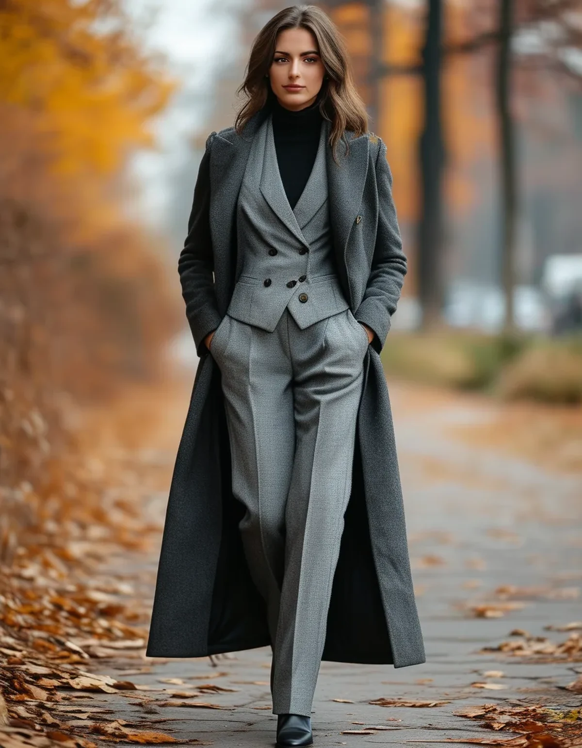
Now there is a jacket over a knit over the same base and the whole thing looks like a shape rather than a person.
The colour is doing exactly what it always did. There is just more of it.
Why does adding a layer change what monochrome does?
Because the mechanism that makes monochrome flattering is about outline, and layers change outlines dramatically.
Monochrome works by removing horizontal division. No waistband break means the eye travels the full length uninterrupted, which reads as height.
But the eye then reads the total outline as a single object. With nothing to differentiate the pieces, everything within the outline becomes one shape — and shape is what you notice.
Layers add depth without adding definition. A jacket adds three to five centimetres of width at the arms and torso, and in a single colour that extra width has no visual explanation. It reads as body rather than garment.
Shadows do the work that colour normally does. In a single colour, the only information about where one garment ends and another begins is shading — and in flat autumn overcast light there is very little shading.
Matte fabrics compound it. A matte surface returns almost no specular highlight, so the form disappears and the outline becomes the only readable feature.
And the outline in autumn is wider by design. Outerwear is cut with layering ease. A single colour across a wider outline is simply a bigger shape.
What creates definition without breaking the colour?
Texture, sheen and structural line. All three preserve the tonal effect while restoring information.
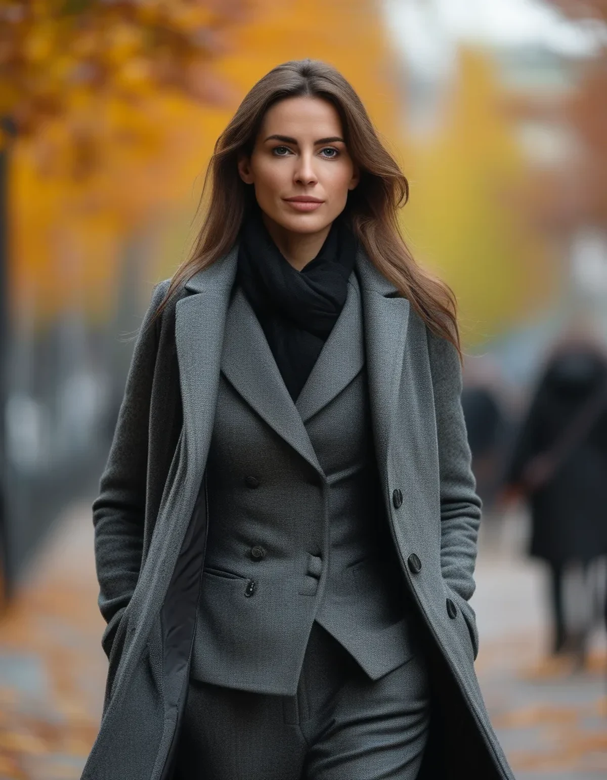
Contrast textures deliberately. A ribbed knit over a smooth base under a quilted shell gives three distinct surfaces in one colour. This is the single most effective fix and it is invisible as a technique.
Mix matte with a little sheen. A satin or coated finish on one piece catches light and separates it from a matte neighbour. One sheen element per outfit is usually enough.
Use tonal variation rather than exact match. Charcoal over black over graphite reads more expensive and more defined than three identical blacks, and it solves the definition problem without introducing colour.
Let a vertical line run through. An open long jacket creates two vertical lines down the body, which restores the elongating effect that the added width took away. Worn open is doing real work here.
Define the waist somewhere. A belt, a drawstring, or simply a shorter mid-layer over a longer base creates one intentional horizontal that reads as shape rather than accident.
Control the shoulder. A structured shoulder keeps the outline defined; a soft dropped shoulder in a heavy fabric widens it. In monochrome, the shoulder line is the most influential single detail.
Vary hem lengths deliberately. Base longer than mid-layer, mid-layer longer or shorter than jacket. Staggered hems create the horizontal information that a single colour removes, without breaking the colour.
Which colours are hardest in autumn layers?
Black is easiest, and everything else needs more help than people expect.
Black hides construction almost entirely. That is why it flatters and why it flattens. In heavy layers it becomes a silhouette exercise, so outline control matters more than anything.
Navy and charcoal show more shading than black. Slightly more forgiving in layers because the fabric’s form is visible.
Mid-tone neutrals are the hardest. Taupe, stone and mid-grey show every fold and shadow while offering no slimming contrast. They need texture variation more than any other palette.
Cream and off-white advance visually. Light colours expand apparently, so a full cream layered outfit reads considerably larger than a black one of identical cut. It can look wonderful; it just needs a defined outline and a waist.
Rich autumn tones — burgundy, olive, rust — behave like navy. They show shading, which helps, and they read as considered rather than default.
Seasonal note: two blacks from different seasons rarely match, and layering exposes it. Dye lots vary, and washing shifts black toward grey-brown over time. If your monochrome suddenly looks like three near-misses, that is dye fade, not your styling — leaning into intentional tonal variation is the easier fix than chasing an exact match.
5 Mistakes That Make Layered Monochrome Read Heavy
Matching everything exactly and in the same texture. Three matte pieces in one identical black is the flattest possible combination. Vary one thing.
Buttoning the outer layer. A closed coat over layers in one colour turns the whole outfit into a single block. Worn open, it creates two vertical lines and does the opposite.
Choosing an oversized outer layer because the colour will hide it. Monochrome hides construction, not volume. Volume is the one thing it emphasises.
Skipping the waist entirely. Without a single intentional horizontal somewhere, there is nothing to read the proportion against.
Matching shoes and bag to everything too. Continuing the colour to the extremities makes the mass larger. Letting the shoe differ in texture or tone breaks it usefully.
And the frequent one: photographing it in flat overcast light and concluding the outfit is the problem. Directional light restores definition to monochrome instantly. Check it in person before you retire the combination.
FAQ: Monochrome Layering Questions, Answered
Should I still wear all black in autumn?
Yes — it is the most forgiving base for layers. Just add texture variation and keep the outer layer open.
How many textures is too many?
Three distinct textures in one colour reads as considered. Four or more starts to look busy without the benefit of contrast.
Is tonal better than exact match?
In layers, usually yes. Tonal variation gives the definition that layering removes, and it reads as more deliberate.
Does monochrome still elongate with three layers?
Only if you preserve a vertical line — an open jacket, a long line down the front, or a staggered hem. Otherwise you keep the mass and lose the length.
Why do my blacks not match anymore?
Dye lots differ between products and seasons, and washing shifts black over time. Lean into tonal rather than chasing a match.
What is the fastest fix if an outfit reads heavy?
Open the outer layer and define the waist. Those two changes together fix most of it in five seconds.
TL;DR:
- Monochrome elongates by removing breaks — which means the eye reads the whole outline as one mass.
- Layers add width without adding definition, so the mass grows while the outline stays unbroken.
- Fix with texture contrast, one sheen element, tonal variation and staggered hems.
- Wear the outer layer open to restore vertical lines, and define the waist once.
- Mid-tone neutrals and cream are hardest; black is the most forgiving.
The colour is fine. Give it something to describe the shape.
Keep Reading
This article is for general informational and styling purposes only. Fit, sizing, and product availability may vary.