Why a Monochrome Activewear Outfit Reads as More Put-Together, Even With Zero Extra Effort
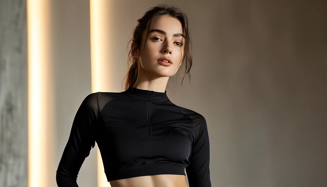
Quick Answer: Monochrome outfits read as more intentional because a single dominant color eliminates the visual decision-making a mixed-color outfit implicitly signals — the eye processes one unbroken tone as a single coherent choice, while multiple colors, even well-matched ones, read as several separate decisions strung together.
Same effort, same closet, same morning — but the single-tone outfit consistently gets read as the more deliberate, more “together” choice. The reason has more to do with how the eye processes color than with the outfit itself.
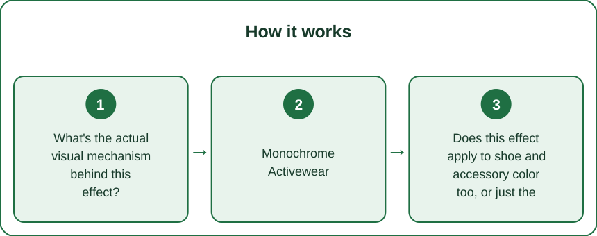
What’s the actual visual mechanism behind this effect?
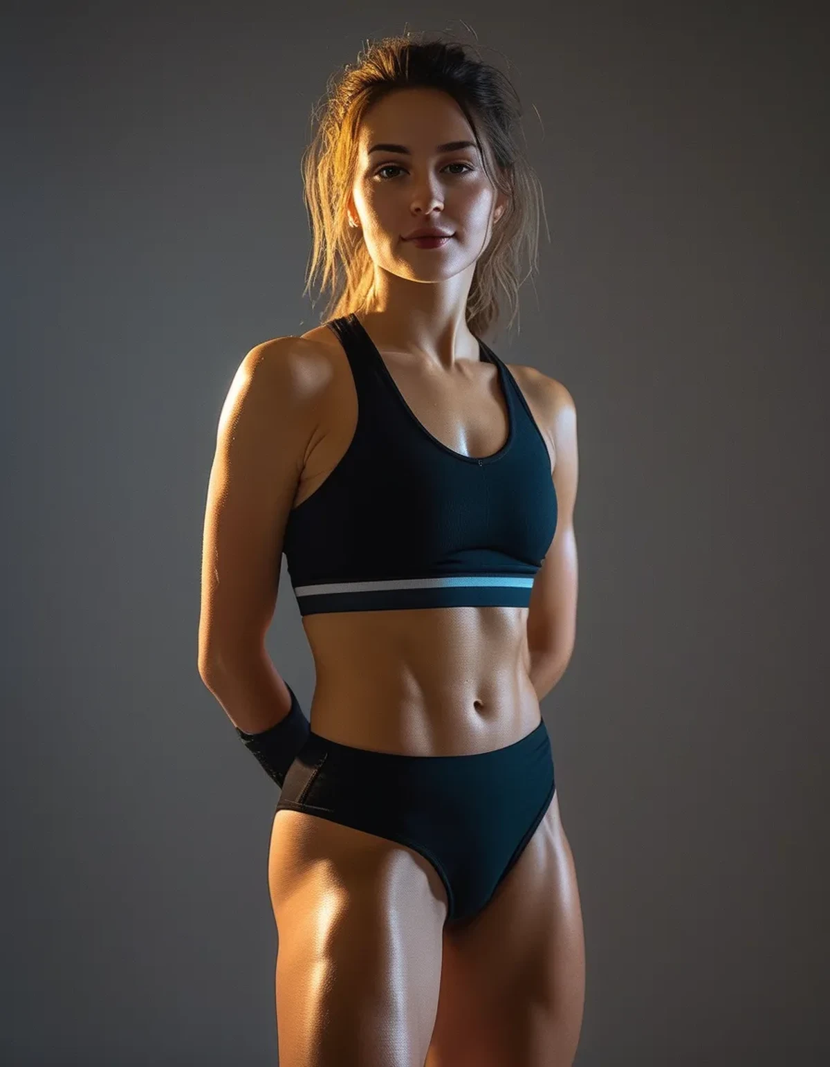
A single dominant tone across an outfit is processed by the eye as one cohesive visual unit, rather than several separate elements that need to be individually reconciled — this reduces visual “noise” and reads as more deliberate, even when the actual styling effort was minimal.
Multiple colors, even genuinely well-coordinated ones, require the eye to process several relationships at once (does this shade of blue work with that shade of gray?) — a monochrome outfit skips that step entirely, which is part of why it reads as effortless.
Monochrome Activewear: One Color, Different Shades — Does That Still Count?
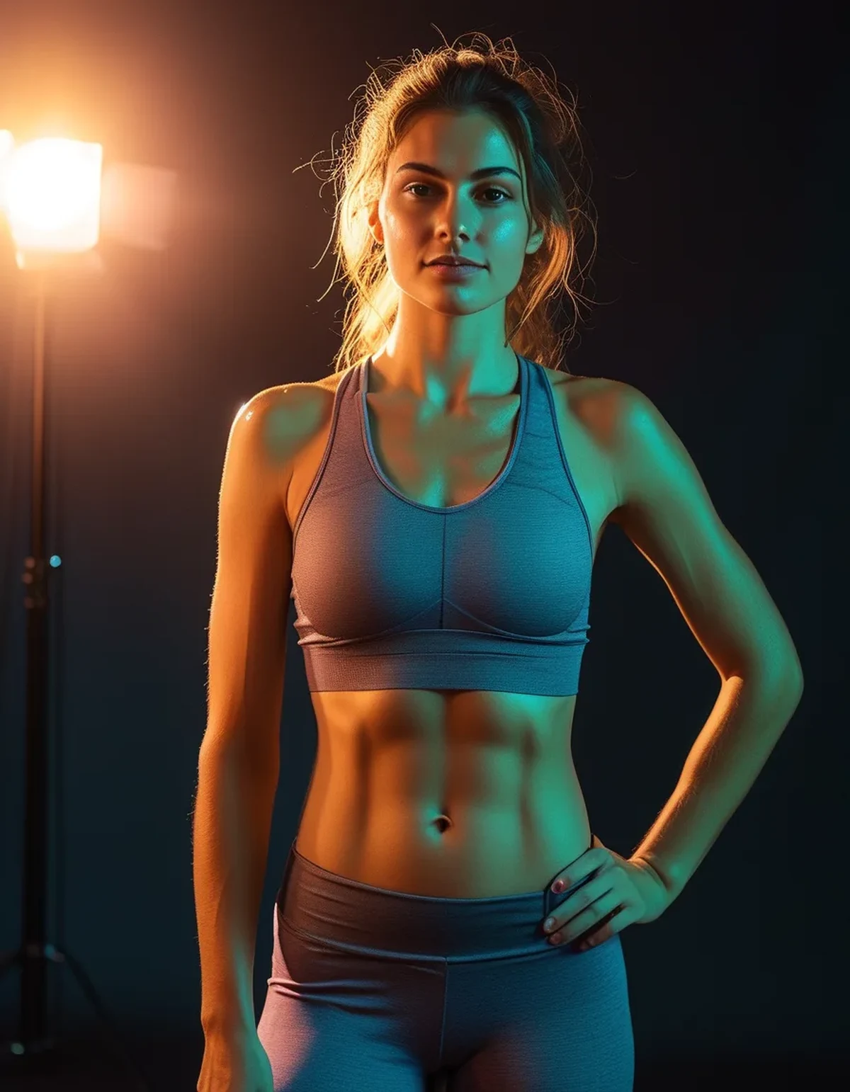
Varying shades within the same color family (navy top, lighter blue leggings) still produces most of the cohesive effect, since the eye reads tonal variation within one hue as intentional rather than as visual noise, unlike true multi-color combinations.
This shade-variation approach also adds subtle visual interest that a single flat, identical tone throughout can sometimes lack, making it a practical middle ground between pure monochrome and full color mixing.
Does this effect apply to shoe and accessory color too, or just the main outfit?
Shoes and accessories in a contrasting color can either break or reinforce the monochrome effect, depending on how much visual weight they carry — a small contrasting accent (like colorful shoes) is generally read as an intentional styling choice, while a larger contrasting element competes with the outfit’s cohesion.
A shoe color that closely matches or complements the outfit’s dominant tone extends the elongating, cohesive visual effect down through the whole silhouette, which is part of why monochrome outfits are also associated with the leg-lengthening effect discussed in proportion-focused styling.
Is monochrome dressing actually faster to put together, or does it just look that way?
Once a color palette is established in your wardrobe, monochrome dressing genuinely does reduce decision time, since fewer color-matching decisions need to be made each morning compared to coordinating multiple distinct colors.
The upfront effort is more about building a wardrobe with enough pieces in your chosen core tones, after which the day-to-day styling decision becomes genuinely simpler, not just simpler-looking.
FAQ: Monochrome Activewear Questions, Answered
Does monochrome dressing work with any color, or only neutrals?
It works with any color, including bolder shades, though neutrals (black, gray, navy) are the most versatile starting point for building a monochrome wardrobe capsule.
Is it possible for monochrome to look boring rather than put-together?
Texture variation between pieces — a ribbed top with a smooth legging, for instance — helps avoid a flat, one-dimensional look while keeping the cohesive color effect.
How many pieces do I need in one color to make monochrome dressing practical day to day?
A handful of interchangeable pieces (2-3 tops, 2-3 bottoms) in your core tone is generally enough to mix and match into several different monochrome outfits without repetition feeling obvious.
TL;DR:
- A single dominant tone reads as one intentional visual choice rather than several separate decisions
- Varying shades within one color family still preserves most of the cohesive effect
- Small contrasting accents can reinforce the look, while larger ones compete with it
- Building a core-tone wardrobe upfront genuinely simplifies daily styling decisions afterward
The put-together read isn’t about extra effort — it’s about giving the eye one coherent color to process instead of several to reconcile.
See It in Motion
Seen here: High Waist Yoga Leggings with Inner Pocket — shop it on bubblelime.com
Keep Reading
This article is for general informational and styling purposes only. Fit, sizing, and product availability may vary.