Why Monochrome Is Harder in Any Color Other Than Black

Quick Answer: Black is a value, not a hue - two blacks differ mainly in undertone and depth, and the eye is relatively forgiving of that. Any chromatic colour differs in hue, saturation, and value simultaneously, and the eye detects hue mismatch far more readily than value mismatch. That is why a navy that is a fraction warmer reads as an obvious mistake while two different blacks read as one outfit. Match by dyeing origin or commit to a deliberate tonal gradient.
Near-matching a colour looks worse than not matching it at all.
Why does the eye punish colour mismatch more than black mismatch?
Because of what it is comparing.
Colour has three dimensions: hue (which colour), saturation (how intense), and value (how light or dark). Black is essentially a value with a faint hue cast - a warm black leans brown, a cool black leans blue, and both are close to zero saturation. Two blacks differ on one dimension, weakly.
Two navies differ on all three at once. One might be slightly more purple, slightly less saturated, and a half-step lighter. The eye is highly sensitive to hue differences - human vision evolved with strong hue discrimination - and it flags the mismatch immediately even when the person cannot articulate what is wrong.
There is a second effect that makes it worse. Simultaneous contrast: two colours placed adjacent push each other apart perceptually. Two navies that look nearly identical held apart look clearly different when worn together, because each one makes the other look more like its opposite. A slightly warm navy next to a slightly cool navy exaggerates both.
And near-misses are worse than clear differences. A navy top with a black legging reads as an intentional two-colour outfit. A navy top with a slightly different navy legging reads as an attempt that failed. The eye interprets near-matching as error and clear contrast as choice, which is the practical heart of the whole problem.
Sheen makes it worse still. Two pieces in the identical dye can read as different colours if one is matte and one has a slight sheen, because the sheen reflects ambient light and lifts the apparent value. This is why a matte legging and a shiny sports bra in the same dye lot still look mismatched - the fabric finish is doing what a colour difference would do.
What conditions make the mismatch visible?
Light, mostly, and it is why an outfit can look fine at home and wrong outside.
Metamerism is the technical name for the problem. Two dyes can reflect light identically under one light source and differently under another, because their spectral reflectance curves differ even where the perceived colour matched. Two navies that match perfectly under warm indoor lighting can be obviously different in daylight.
The practical consequence: you must check colour matching in daylight, ideally near a window or outside, not under bathroom or bedroom lighting. Anything assembled under warm indoor light is being assembled under the most forgiving possible condition.
Conditions that expose mismatch:
- Direct daylight, the harshest test and the one that matters, since it is where you will be seen
- Camera flash, which is why gym photos reveal mismatches the mirror did not
- Fluorescent and LED lighting, which have spiky spectra that exaggerate hue differences
- Bright overcast, a broad even light that removes shadows and leaves colour as the only variable
Conditions that hide it:
- Warm low indoor light, where everything drifts toward amber
- Low light generally, since hue discrimination falls as light drops
- Movement and distance, which is why an outfit that looks off in the mirror can look fine in a video
Wash history compounds everything. Two pieces that matched new diverge as one is washed more, exposed to more UV, or dried differently. Colour fade is not uniform across dye types - some colours shift hue as they fade rather than simply lightening, and navy is particularly prone to drifting toward grey-purple.

How do you actually build a coloured monochrome outfit?
Three viable strategies. Pick one and be consistent.
Strategy 1: buy the set, or buy same-brand same-season. The only reliable way to get an exact match is pieces produced from the same dye lot. Same brand, same collection, same season is the practical version of that. Same brand in a different season is not reliable - dye lots change and brands reformulate.
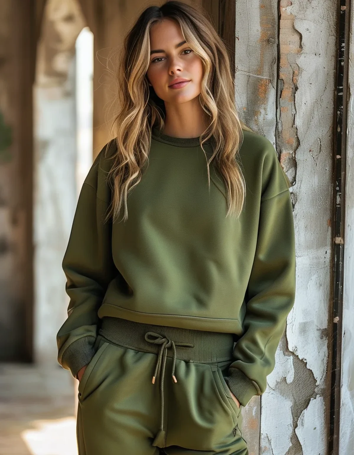
Strategy 2: go deliberately tonal. Instead of matching, space the pieces at least two clear steps apart in value within the same hue family. Light olive top, mid olive jacket, deep olive legging. Because the differences are obvious and graduated, the eye reads intention rather than error. This is easier to execute than exact matching and it usually looks more expensive, because it adds depth that a flat single colour lacks.
Strategy 3: break the near-match with a hard separator. If two pieces are close but not identical, introduce a clearly different element between them - a black waistband, a white sock line, a contrasting jacket. The separator stops the eye from directly comparing the two similar colours, which is the specific thing that makes a near-miss look like a mistake.
Colours ranked by difficulty:
- Easiest: black, charcoal, cream, and true grey. Low saturation means less hue to mismatch.
- Moderate: olive, taupe, and deep burgundy. Complex undertones, but usually worn in muted saturations that hide small differences.
- Hard: navy. The classic problem colour. Blue dyes vary enormously in undertone and fade unpredictably.
- Hardest: mid-saturation brights - coral, teal, mid-blue, lilac. High saturation makes every hue difference visible, and simultaneous contrast is strongest here.
Two practical rules. Add texture rather than hoping for an exact colour match - a ribbed top with a smooth legging in the same colour family reads as deliberate even when the shades differ slightly, because the texture explains the difference. And buy the second piece with the first in hand, in daylight, rather than from memory. Colour memory is unreliable over even a few minutes.
Myth vs Fact: Matching Colours
Myth: Same brand means same colour. Fact: Dye lots vary between production runs, and brands reformulate colours between seasons. Same brand, same season is reliable; same brand, different season is not.
Myth: If it matches in the store, it matches. Fact: Store lighting is usually warm and flattering. Metamerism means two fabrics can match under one light and diverge under another. Check in daylight.
Myth: Navy and black never work together. Fact: They work well as a deliberate two-colour combination, precisely because the contrast is clear. What fails is navy with a slightly different navy.
Myth: Monochrome means one exact colour. Fact: Tonal dressing - graduated shades of one hue - is a distinct and usually easier approach, and it often reads as more considered than a flat exact match.
Myth: Photos are a good way to check matching. Fact: Phone cameras apply automatic white balance that can shift colours. Trust your eyes in daylight over the screen.
Myth: Fabric type does not affect perceived colour. Fact: It matters enormously. The same dye on a matte knit and a sheeny woven reads as two colours, because finish changes reflected light.
FAQ: Coloured Monochrome Questions, Answered
Why do my two navy pieces look different outside but not inside?
Metamerism - the dyes reflect light differently under different spectra. Daylight has a broad even spectrum that exposes differences warm indoor light hides.
Is tonal dressing the same as monochrome?
Related but distinct. Monochrome aims for one colour; tonal uses graduated shades of one hue. Tonal is more forgiving and often looks more deliberate.
How far apart should tonal shades be?
Far enough that the difference is unmistakable - at least two clear steps in value. Anything closer reads as a failed match rather than a gradient.
Which colours are safest for building a multi-piece monochrome wardrobe?
Black, charcoal, cream, and true grey. Low saturation means less hue variation to go wrong.
Can I fix a slightly mismatched pair?
Not by dyeing at home reliably. Better to introduce a separator - a contrasting layer, sock line, or waistband - between the two pieces so the eye stops comparing them directly.
TL;DR:
- Black differs mainly in value; chromatic colours differ in hue, saturation, and value at once, and the eye detects hue mismatch most readily.
- Near-matching reads as error. Clear contrast reads as choice.
- Metamerism means colours that match indoors can diverge in daylight. Always check outside.
- Three working strategies: buy the set, go deliberately tonal with two clear steps between shades, or separate near-matches with a contrasting element.
- Fabric finish changes perceived colour - a matte and a sheeny piece in the same dye still read as different.
Check any colour pairing in daylight, with both pieces in hand. Colour memory does not survive the walk across the store.
See It in Motion
Seen here: High Waist Embossed Yoga Leggings with Side Pockets — shop it on bubblelime.com
Keep Reading
This article is for general informational and styling purposes only. Fit, sizing, and product availability may vary.