Why Monochrome Activewear Reads as More Expensive, Even at the Same Price Point
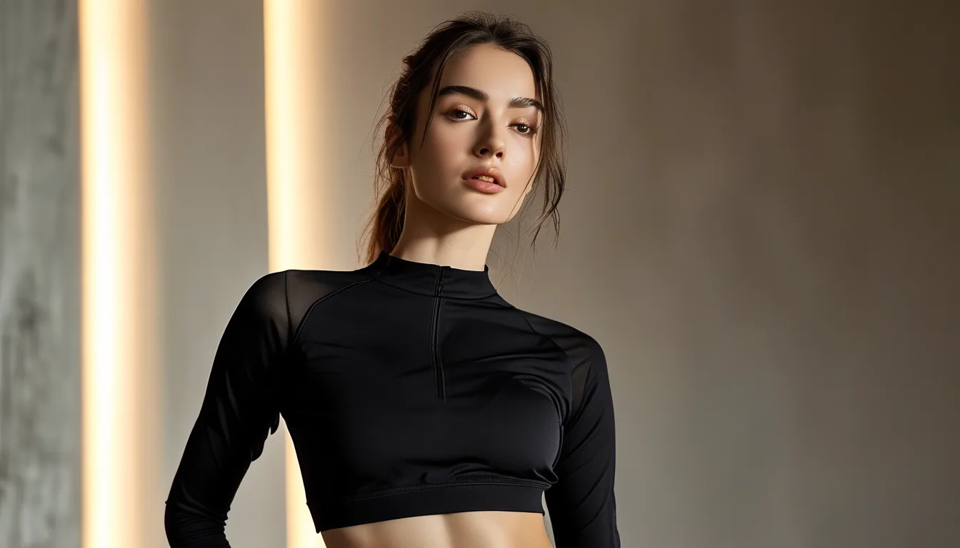
Quick Answer: A single, unbroken color from top to bottom removes visual segmentation points that draw attention to individual piece quality or minor fit imperfections, letting the eye read the outfit as one cohesive silhouette rather than assembled separate parts — this cohesion effect is what creates the more expensive appearance, independent of actual price.
Why does the exact same budget legging and top look noticeably pricier in matching black than in two mismatched colors? The answer is about visual segmentation, not fabric quality.
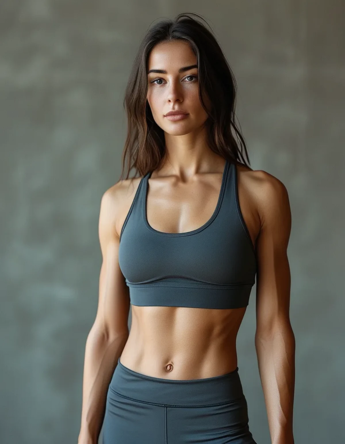
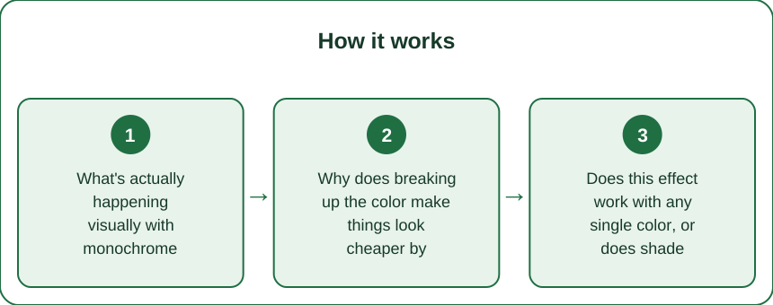
What’s actually happening visually with monochrome outfits?
A single continuous color removes horizontal break points where the eye would otherwise stop and separately evaluate each piece. Without those breaks, the outfit reads as one cohesive silhouette, which is a visual cue associated with intentional, higher-end styling.
Why does breaking up the color make things look cheaper by comparison?
Contrasting colors create natural stopping points for the eye, which also happen to be where minor quality differences (a slightly different fabric sheen, a fit imperfection) become more noticeable, since each piece is being evaluated somewhat independently rather than as part of one unified look.
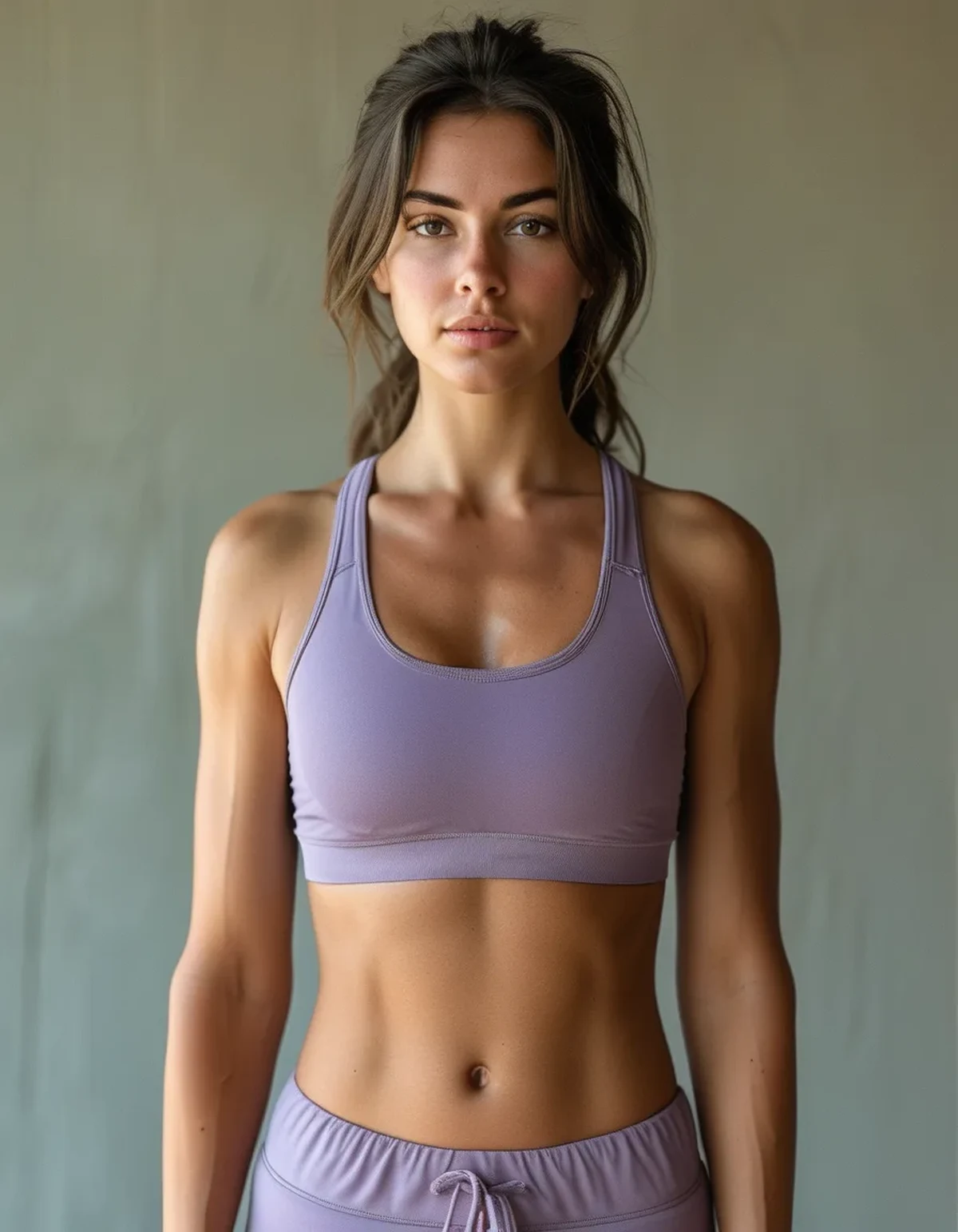
Does this effect work with any single color, or does shade matching matter?
Shade matching matters significantly — two pieces in slightly different shades of the ‘same’ color (a warm black top with a cool black legging) can actually look more mismatched than genuinely different colors worn intentionally, since the near-match reads as an error rather than a deliberate choice.
Does this apply to budget and premium activewear equally?
Yes — the cohesion effect is about color relationship, not fabric price point, meaning it’s one of the more accessible styling tools available regardless of budget, unlike fabric quality itself which does correlate more directly with price.
FAQ: Monochrome Activewear Visual Effect, Answered
Does this work with colors other than black or neutral tones?
Yes — any single consistent color or tone from top to bottom produces the cohesion effect, though neutrals show shade-matching mistakes less than saturated colors do.
How do I make sure two ‘black’ pieces actually match?
Checking them together in natural light before purchase, or buying from the same brand’s matching set line, reduces the risk of subtle undertone mismatches.
Does adding accessories break the monochrome effect?
Not necessarily — small accent accessories can complement a monochrome base without disrupting the core cohesion effect, as long as they don’t compete heavily.
TL;DR:
- A single unbroken color removes visual break points that invite scrutiny of individual pieces
- Contrasting colors create stopping points where minor quality or fit issues become more visible
- Shade matching matters more than color choice itself — near-matches can look like mistakes
- The cohesion effect works regardless of price point, making it an accessible styling tool
See It in Motion
Seen here: High Waist Yoga Leggings with Side Pockets — shop it on bubblelime.com
Keep Reading
This article is for general informational and styling purposes only. Fit, sizing, and product availability may vary.