How to Build a Tonal Outfit That Reads as Rich Instead of Flat

Quick Answer: A tonal outfit reads as rich when it varies texture, value, and finish — not when the colors match exactly. Three fabrics with visibly different surfaces in the same color family creates depth; three pieces in identical fabric creates a uniform. Aim for at least two textures and a shade difference of two or three steps between your lightest and darkest piece.
You wore all one color and it looked either like a magazine or like a jumpsuit that came apart.
The variable that separated those two outcomes almost certainly was not the color you picked.
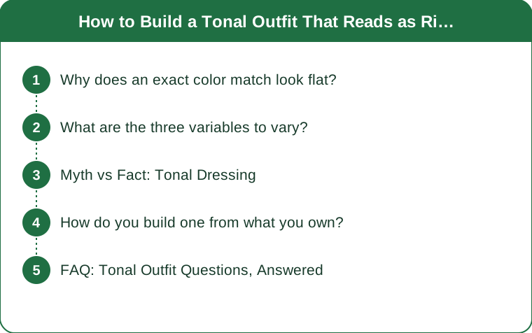
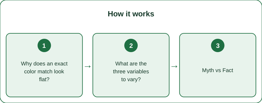
Why does an exact color match look flat?
Because it removes every dimension the eye uses to read depth.
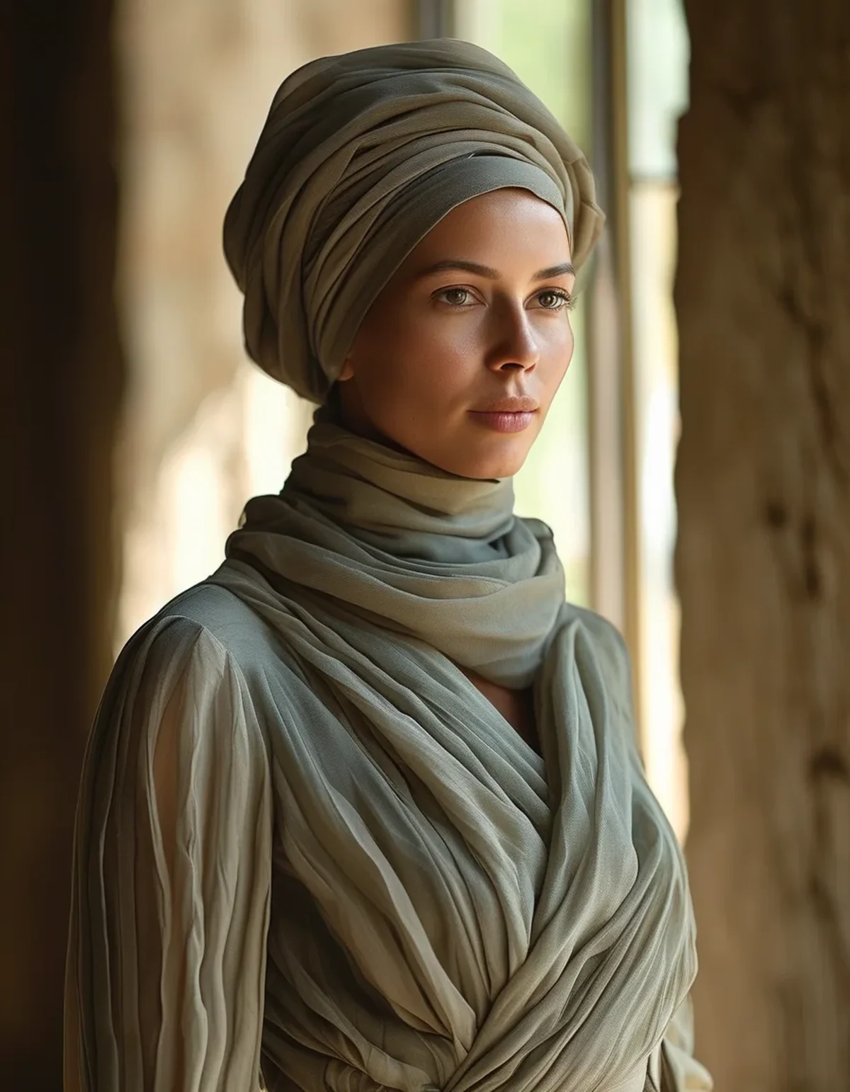
Identical color plus identical texture equals a single surface. The eye reads shape through shadow and contrast. A perfectly matched outfit has neither internal to it, so the whole thing reads as one silhouette with no interior information.
Cameras flatten it further. A phone camera compresses subtle tonal difference, so an outfit with a little depth in person becomes completely flat in a photo. If your tonal outfits look better in the mirror than on your phone, this is the reason.
Uniform associations kick in quickly. Matched color plus matched fabric is the definition of a uniform, and the brain reaches that association fast.
And exact matching is nearly impossible anyway. Two black garments from the same brand are usually slightly different blacks because of fiber content and dye batch. Trying to match exactly means you end up with near-misses, which look like mistakes — whereas deliberate variation looks like a choice.
So the goal is not matching. It is staying inside one color family while varying everything else.
What are the three variables to vary?
Texture first, value second, finish third.
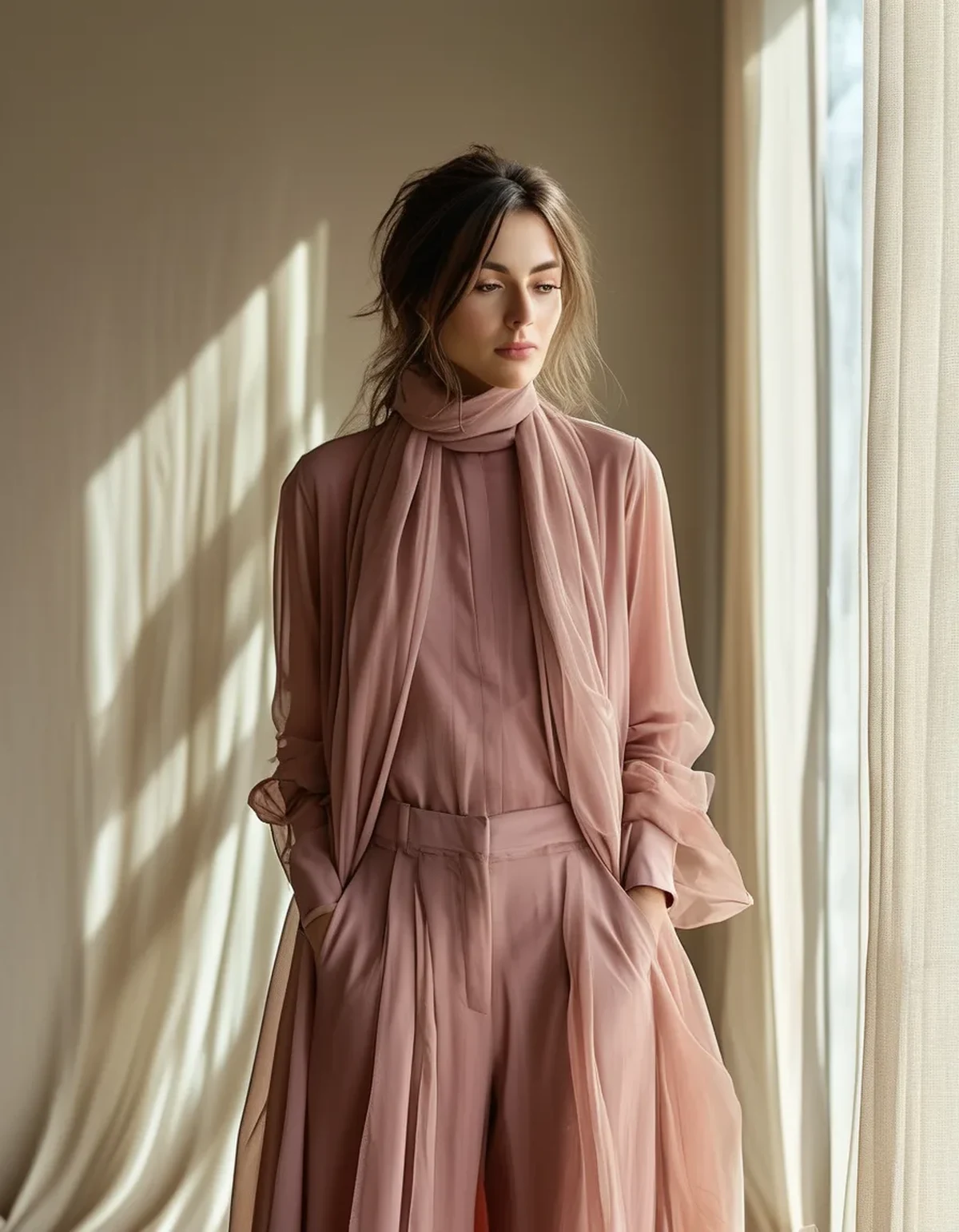
Texture — the biggest lever. A ribbed knit next to a smooth technical fabric next to a brushed fleece produces three visibly different surfaces in the same color. Aim for at least two clearly different textures per outfit; three is better.
Value — how light or dark. Two or three steps of difference between your lightest and darkest piece reads as intentional depth. Zero steps reads flat, and six steps stops being tonal and becomes a contrast outfit.
Finish — how much light reflects. Matte, satin, and technical sheen all catch light differently. This is why a matte legging with a slightly sheened jacket works so well: the finish difference does the work even when the color is identical.
Rank the levers by how much they cost you. Texture is free — you already own varied fabrics. Value requires buying within a family. Finish is the most subtle and the easiest to get wrong.
And leather, suede, and metal hardware all count as texture. A bag or a shoe frequently supplies the third texture without any change to the clothes.
Myth vs Fact: Tonal Dressing
Myth: Tonal outfits have to be neutral colors. Fact: The principle works in any color family. Head-to-toe olive, rust, or navy follows exactly the same rules. Neutrals are simply more common because people own more of them, not because tonal dressing requires them.
Myth: All-black is the easiest tonal outfit. Fact: All-black is the hardest, because black hides texture in low light and different blacks read as mistakes rather than as variation. A mid-tone family — greys, camels, olives — shows texture far more clearly and is much more forgiving.
Myth: Tonal outfits are automatically lengthening. Fact: The uninterrupted line does lengthen, but only if the shoe and bag continue the color story. A tonal outfit stopped by a contrasting shoe cuts the line at the ankle and gives up most of the benefit — which is the detail that surprises people who bought the whole outfit and then wore white sneakers with it.
Myth: You need pieces bought as a set. Fact: Sets are the flattest version because they are usually the same fabric. Assembling from separates in different fabrics produces a better tonal outfit than buying a matched set, and it costs less.
Myth: More is more with texture. Fact: Four or more distinct textures starts to look busy rather than rich, especially in photographs. Two or three is the working range.
How do you build one from what you own?
Five steps, about ten minutes.
Pick the color family with the most pieces. Whatever you own most of — probably black, grey, navy, or beige. Depth requires options.
Lay out everything in that family and sort by value, lightest to darkest. You will usually find two or three natural groupings.
Pick three pieces spanning two to three value steps, then check the fabrics. If two are the same fabric, swap one.
Add the shoe and bag from the same family, or from an adjacent neutral that reads as part of it. This is the step that determines whether the line continues to the floor.
Photograph it before you commit. Tonal outfits are the category where the mirror and the camera disagree most, and the camera is closer to how other people see you across a room.
Seasonal note: fall is the easiest season for this. Knitwear, suede, corduroy, and wool coats supply texture variation that summer fabrics simply do not have — which is why tonal dressing looks so much richer from September onward with no additional effort.
FAQ: Tonal Outfit Questions, Answered
How many pieces should be in the same color?
Three is the practical target — typically top, bottom, and outer layer — with the shoe and bag either in the family or in a quiet complementary neutral. Two pieces reads as coordinating rather than tonal; four or more requires very careful texture work to avoid looking like a costume.
Does tonal dressing work in activewear specifically?
It works well, and technical fabrics actually help because they come in a wide range of finishes — matte, sheen, ribbed, mesh — within the same color. The trap is that activewear sets are sold as matched fabric pairs, which is the flattest possible starting point. Mix across brands rather than buying a set.
What do I do when two blacks obviously do not match?
Add a third piece that is clearly a different value — a charcoal or a grey — so the outfit reads as a deliberate tonal range rather than a failed match. Adding difference fixes a near-miss far more reliably than trying to hide it, and it is the fastest save when you notice the problem on your way out the door.
TL;DR:
- Exact color matching is what makes tonal outfits look flat; deliberate variation is what makes them look rich.
- Vary texture first, then value by two or three steps, then finish.
- Continue the color to the shoe and bag or you lose most of the lengthening effect.
- Separates beat matched sets, and fall fabrics do this better than summer ones. Lay out your largest color family this weekend and find three pieces with three different surfaces. That single exercise teaches the principle faster than any rule about which colors go together.
Keep Reading
This article is for general informational and styling purposes only. Fit, sizing, and product availability may vary.