Monochrome Falls Flat Without Texture, and Nobody Mentions the Sheen

Quick Answer: When color contrast is removed, the eye reads texture and sheen instead. Two matte pieces in the same tone read flat; a matte piece with a subtly ribbed or brushed piece reads intentional. Mixing high-shine with matte in the same color reads as a mismatch, not a look.
You wore all black and it looked cheap. You wore all black a week later and it looked expensive. The color did not change and neither did the fit. The surfaces did.
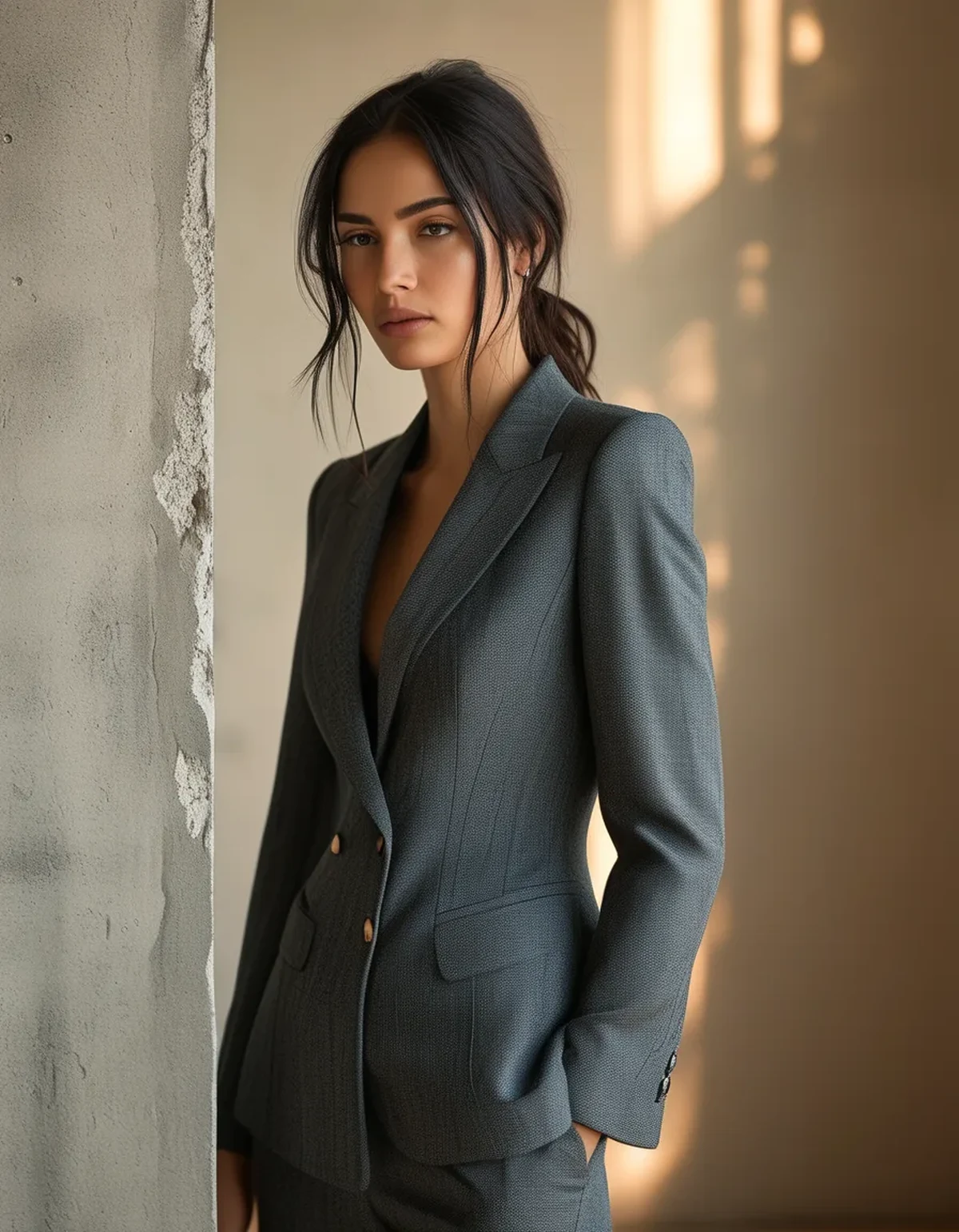
Why does monochrome need texture at all?
Vision is built around edges. Color contrast normally supplies them. Remove it and the eye needs another way to distinguish where one thing ends and the next begins.
Texture provides that edge through micro-shadow. A rib knit throws tiny shadows; a smooth knit does not. Put them next to each other and the boundary becomes legible without any color change.
Without that, an outfit reads as a single undifferentiated shape. That is the flatness people describe, and it is a perception problem, not a taste problem.
What is the sheen mismatch problem?
Sheen is how much light a surface reflects specularly, in a mirror-like way, rather than diffusely.
A glossy compression legging and a matte cotton-blend tee in the same black are not the same black to the eye. Under any directional light, the glossy piece reads as lighter and slightly cooler, sometimes noticeably.
That is why the pairing looks like a failed match rather than a deliberate tonal outfit. Either keep sheen consistent, or make the difference big enough to read as intentional, like a matte base with a deliberately shiny outer layer.
Which texture combinations reliably work?
Pair one structured surface with one soft surface, keeping sheen in the same family.
- Ribbed top with a smooth matte legging
- Brushed fleece with a matte woven short
- Waffle knit with a plain jersey
- Suede-finish or peached fabric with a flat knit
What does not work: two ribs in different rib scales, which reads as an accident, or three or more distinct textures, which reads as busy and undoes the calm that made monochrome appealing.
Two textures. One sheen family. That is nearly the whole rule.
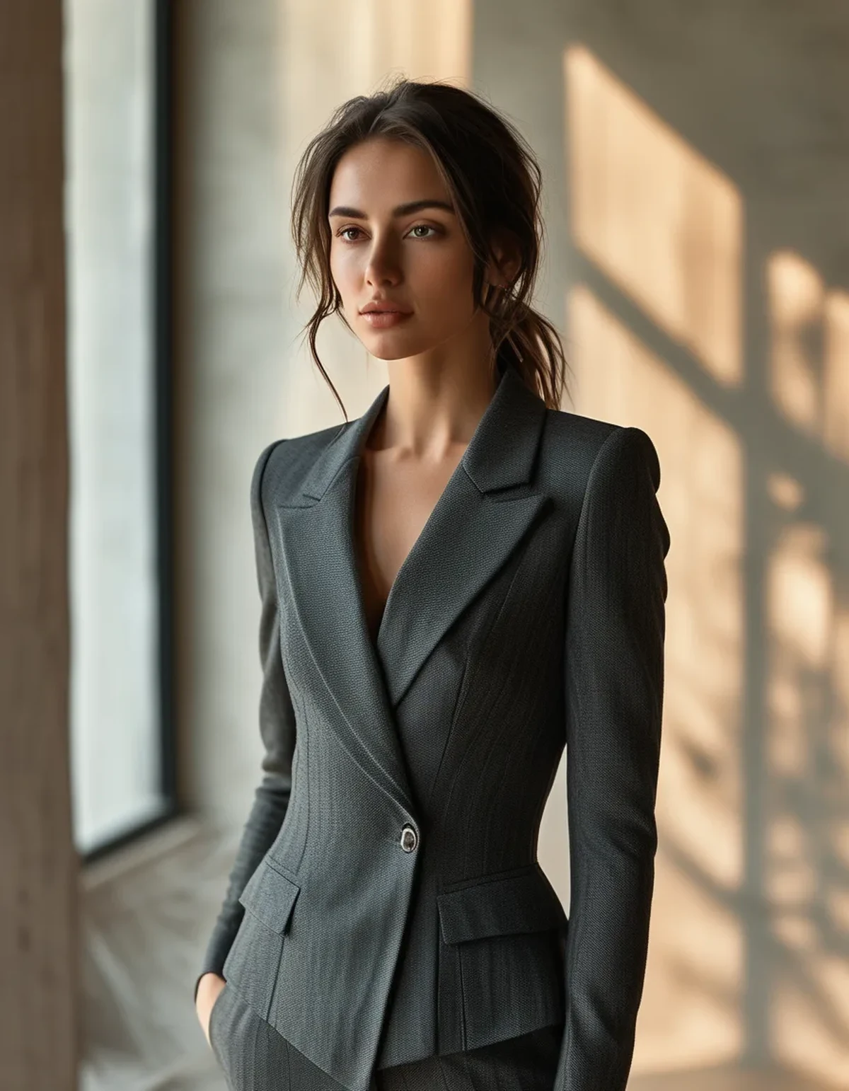
Myth vs Fact: Monochrome dressing
Myth: The pieces have to match exactly. Fact: close-but-not-identical tones often look better than exact matches, because slight variation reads as depth. Exact matching is only necessary when the pieces sit adjacent, like a set.
Myth: All black is the easiest monochrome. Fact: black is the hardest, because black fades unevenly and shows sheen differences most dramatically. Charcoal, navy, and olive are far more forgiving.
Myth: Monochrome is inherently slimming. Fact: it creates an unbroken vertical line, which helps, but a flat monochrome outfit with no texture can read as a solid block, which does the opposite.
Myth: Accessories fix flat monochrome. Fact: they distract from it. The flatness is still there; you have just given the eye somewhere else to go.
How do I check an outfit before leaving?
Two tests, thirty seconds.
- Photograph it. A phone photo flattens depth, which exaggerates the flatness problem. If it looks flat in the photo, it will look flat in a room.
- Turn sideways to a window. Directional light exposes sheen mismatch instantly. If one piece suddenly reads lighter, that is your problem piece.
If you fail either test, the fastest fix is swapping one piece for something with visible surface, a rib, a waffle, a brushed finish. It usually takes one substitution, not a rebuild.
FAQ: Monochrome Questions, Answered
Do fabrics have to be the same fiber?
No, and different fibers often help, since they naturally produce different textures. Just keep sheen levels compatible.
How many pieces make a monochrome outfit?
Two or three is the sweet spot. Beyond three, matching all tones becomes unrealistic and something will read off.
What color is easiest to start with?
Charcoal or deep olive. Both hide dye variation well and mix across fabric types more forgivingly than true black.
TL;DR:
- Without color contrast, the eye reads texture, so monochrome needs at least two surfaces
- Sheen mismatch, not color mismatch, is why same-color pieces look wrong together
- One structured plus one soft texture, same sheen family, is the reliable formula
- Photograph the outfit or turn sideways to a window to catch problems in seconds
Open your closet and put a ribbed piece next to a smooth piece in the same tone. That single pairing is the whole technique, and it explains why the expensive-looking version and the flat version were never about the color at all.
See It in Motion
Seen here: Super High Waist Embossed Yoga Leggings with Inner Pocket — shop it on bubblelime.com
Keep Reading
This article is for general informational and styling purposes only. Fit, sizing, and product availability may vary.