How to Pick the Monochrome Color That Actually Flatters Your Undertone
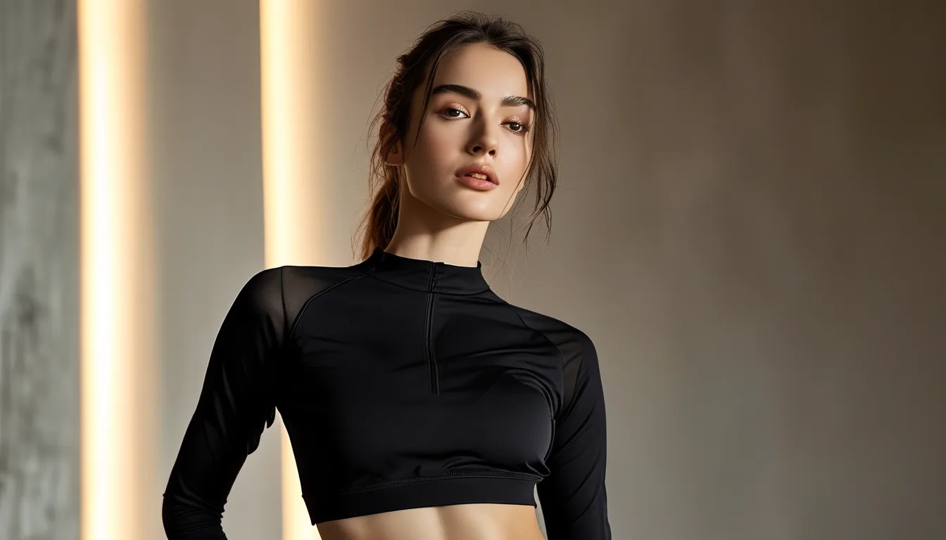
Quick Answer: A monochrome set multiplies its color’s effect on your complexion — twice the surface area, right up against your face and along your whole frame — so undertone matching matters more here than anywhere else in activewear. Find your undertone with the vein, jewelry, and white-paper checks: greenish veins and gold-flattering skin lean warm (olive, rust, camel, warm chocolate monochromes); bluish veins and silver-flattering skin lean cool (navy, berry, charcoal, icy tones); mixed signals mean neutral, which wears the widest range. Test any shade against your bare face in daylight before committing to the full set — the fastest fix in all of activewear shopping.
Monochrome is the highest-stakes color decision you can make while getting dressed: one wrong shade in a single legging is a detail, but the same wrong shade from ankle to shoulder is the whole outfit filing a complaint. The undertone system exists precisely for this decision, and it takes ten minutes to run once.
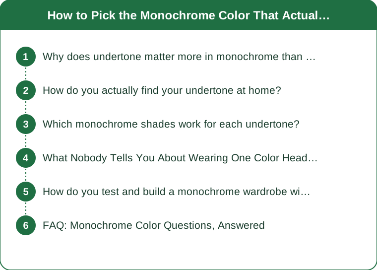
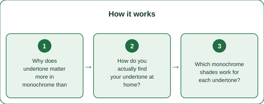
Why does undertone matter more in monochrome than anything else?
Because monochrome removes every buffer an outfit normally has.
A mixed outfit gives your eye multiple colors to average — a so-so shade in the leggings gets rescued by a better one in the top. Head-to-toe color eliminates the averaging: one hue occupies your entire frame, reflects onto your jawline from the top’s neckline, and frames your face from every angle. Whatever that color does to your skin, it does it at full volume with no second opinion.
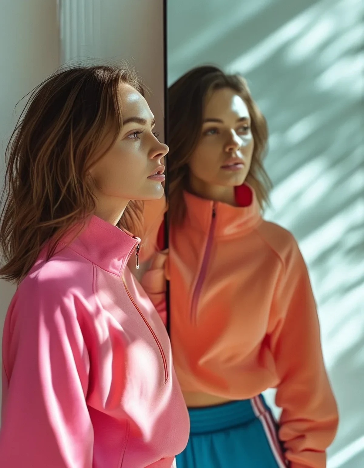
What colors actually do to skin is reflection. Fabric bounces its wavelength onto the nearest surfaces — your neck, jaw, and lower face — and the bounce either harmonizes with your skin’s underlying cast or argues with it. A warm-undertoned complexion under a cool fuchsia top picks up a cast that reads as tired or flushed; the same complexion over olive or rust picks up a glow that looks like sleep and good lighting. The colors did not change your skin; they changed what story the reflection tells.
Monochrome also runs the color along your entire silhouette, so the shade’s visual weight — how heavy, bright, or muted it reads — becomes your outfit’s entire personality. That is the feature: a well-chosen column of color is the most put-together activewear looks ever get, one decision producing a finished outfit. It just means the one decision deserves the ten minutes below.
How do you actually find your undertone at home?
Run three quick checks in daylight and vote by majority — no single test is conclusive.
The vein check. Inner wrist, natural light: veins reading greenish suggest warm undertones; bluish or purplish suggest cool; a genuine mix of both, or can’t-really-tell, points neutral. (Olive skin often reads greenish-veined with a cool-neutral cast — a known special case that behaves like its own category.)
The jewelry check. Which metal makes your skin look more awake — gold or silver? Answer from photos of you wearing each, not from preference. Gold flatters warm; silver flatters cool; both work equally means neutral.
The white-paper check. Bare face, daylight, a sheet of true white paper at your jaw: skin next to it will cast slightly yellow-golden (warm), pinkish-bluish (cool), or neither in particular (neutral).
Tiebreakers if the vote splits: whether you tan easily to golden (warm-leaning) or burn pink first (cool-leaning), and which of your existing tops always earns compliments — your wardrobe has been running this experiment for years and the results are in the compliment record.
Two cautions. Test in daylight only — bathroom bulbs skew everything warm or cold by their own agenda. And undertone is not skin depth: every undertone occurs at every skin shade, and the system works identically across all of them; depth changes which versions of your undertone’s colors work best, which the next section handles.
Which monochrome shades work for each undertone?
The reliable columns, by team — with the universal safety picks at the end.
Warm undertones glow in colors with yellow-golden bases: olive and moss, rust and terracotta, camel and toffee, warm chocolate brown, tomato-leaning red, and creamy off-whites instead of stark white. The warm column to build first: olive set, brown set, rust for the bold days. Approach with caution: icy pastels, blue-based berry, stark black near the face (fine on the bottom half; consider a warmer top).
Cool undertones wake up in blue-and-pink-based color: navy and ink, berry and plum, true pinks, emerald, charcoal, crisp white, and cherry-leaning red. First builds: navy set, charcoal set, berry for personality. Caution list: orange-family shades, yellowed olives, camel right at the neckline.
Neutral undertones hold the widest passport — most mid-saturation shades behave — and get the best results from exactly the colors that dominate the current monochrome market: dusty blues, sage, mauve, taupe, mushroom. The muted middle of every brand’s palette was practically drawn for neutral undertones.
The universal four, flattering across the board and the safest full-set orders sight-unseen: true navy, deep emerald, dusty rose, and medium heathered gray — heathering mixes tones optically, which is why marled fabrics forgive undertone mismatches that flat-dyed versions of the same color would not.
Depth tunes the pick: deeper skin carries the saturated end of its undertone column (true rust, real emerald, rich chocolate) with more impact, while very fair skin often does better one step muted (sage over kelly, dusty rose over fuchsia). Same teams, different volume settings.
What Nobody Tells You About Wearing One Color Head to Toe
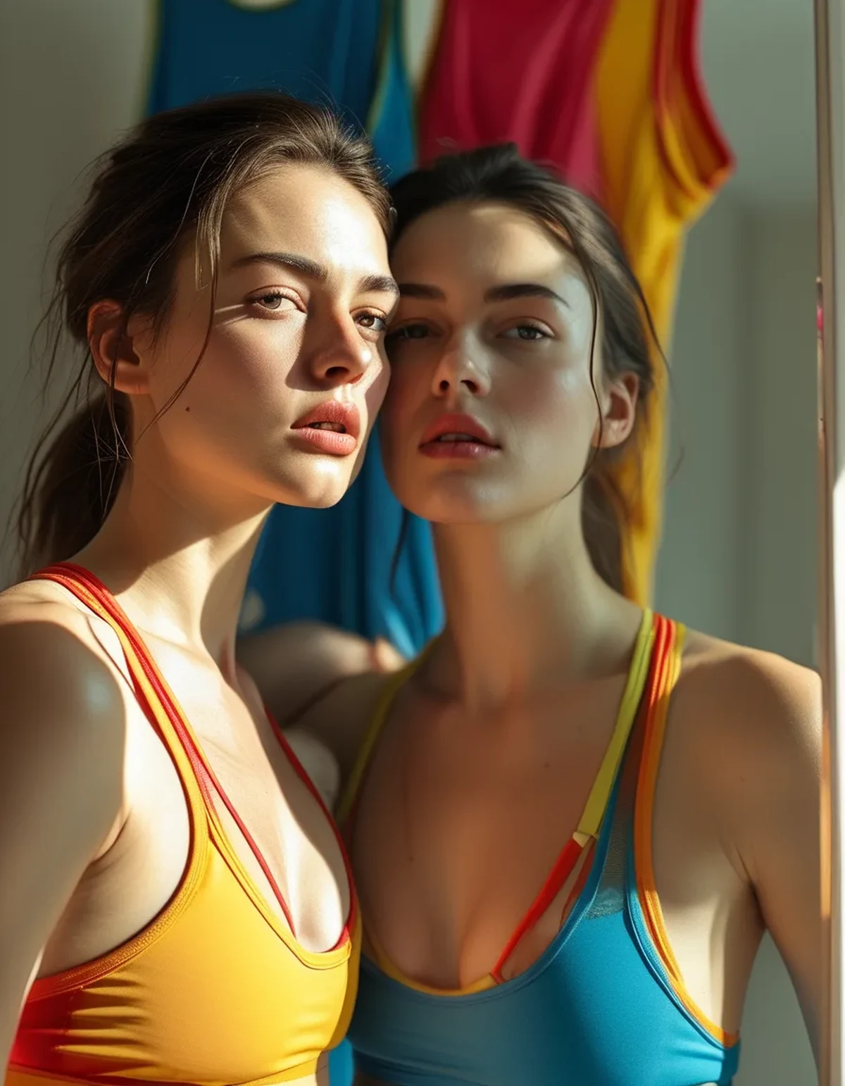
Fabric finish quietly re-colors your color. The same dye reads differently across textures — matte ribbed knits absorb light and deepen a shade, smooth compression fabrics with sheen lighten and cool it, and brushed buttery-soft leggings sit in between with a powdery softness. A monochrome set in two different fabrics is really two neighboring shades, which is usually fine and occasionally the explanation for why a set that matched on the website does not quite match on your body. When in doubt, matching fabric matters as much as matching color.
Sweat is part of the palette decision: the mid-tones — heather gray, dusty blue, sage, mauve — are the sweat-mark honesty zone, while very dark and very light shades keep the secret. A monochrome column in a mid-tone is gorgeous for coffee and errands and a calculated risk for hot yoga; most people end up with a dark column for real training and a muted column for everything else, which is a sensible two-set system rather than a compromise.
Washing drift un-monochromes a set over time — tops and bottoms fade at different rates when washed on different schedules — so the sets you love get laundered as pairs, cold and hung dry, or they slowly become coordinates.
And the styling escape hatch: if a color you love argues with your face, buy it anyway and break the column at the neckline — the offending shade on the bottom three-quarters, a flattering one (or your universal navy) up top, and sixty percent of the monochrome effect survives with none of the complexion tax. The undertone rules govern the shoulders up far more than the hips down.
How do you test and build a monochrome wardrobe without expensive mistakes?
Buy in a sequence that front-loads the cheap information.
Step one costs nothing: raid your closet for anything — a tee, a towel, a scarf — in the candidate color and hold it at your bare face in daylight, phone camera at arm’s length. Take the same photo with two other candidate colors within five minutes; comparison photos reveal what single glances miss, and the difference between a shade that lifts and a shade that drains is usually obvious on the second look.
Step two is the half-set: buy the top only, in your leading color, and wear it near your face for a week. Tops carry all the complexion risk and cost half a set; a winner earns its matching bottom, and a loser becomes a perfectly good top over your existing black leggings. This single habit — tops audition, bottoms follow — eliminates the drawer of regretted full sets that monochrome shoppers accumulate.
Step three builds the system: one dark column in your undertone’s deep shade for training days, one muted column for living days, then a third in your bold pick. Three columns cover a week of looking deliberate. Late summer clearance is the moment for exactly this — buy this season’s proven colors in your team at markdown rather than gambling full price on fall’s new palette, and note that fall drops will lean warm (rust, chocolate, moss) which is a windfall year for warm undertones and a buy-the-navy-now signal for cool ones.
And keep the receipts note: which shades passed the face test, which fabric each set is in. Two lines on your phone, and every future drop takes thirty seconds to evaluate.
FAQ: Monochrome Color Questions, Answered
Is black monochrome always safe?
Nearly — black flatters most people and hides everything, which is why it is the default. The exception is very warm or very fair complexions where head-to-toe black can read stark and shadow the lower face; the two-second fix is warming the neckline with a bronzy tint, gold jewelry, or an off-black charcoal top over true-black bottoms. Nobody needs to give up black; some faces just prefer it at 90 percent.
Do undertone rules change with a tan or in winter pallor?
The undertone itself never changes — it is under the tan, hence the name — but depth shifts seasonally, which tunes saturation: summer-deepened skin carries brighter and richer versions of your column, and winter-fair skin often prefers the muted versions. Same teams year-round, seasonal volume knob.
What about hair color changes — do they move my best monochromes?
Hair frames the face and shifts the contrast math: going significantly darker or lighter can promote or demote shades at the margins, especially near-face colors like camel or charcoal. The undertone column stays valid; re-run the five-minute photo test after a major hair change and let two or three borderline shades switch teams.
Can I wear a monochrome column in a color that is trendy but not in my team?
Yes — via the bottom-heavy trick (trend color hips-down, team color at the neckline), via heathered or washed versions of the trend shade, or via accessories in the trend color against a team-color column. Trends visit the outfit; undertone owns the real estate next to your face.
TL;DR:
- Monochrome doubles a color’s effect on your complexion — the shade at your neckline reflects onto your face all day, so undertone matching earns its ten minutes.
- Find your team with the vein, jewelry, and white-paper checks in daylight: warm (olive, rust, camel, chocolate), cool (navy, berry, charcoal, emerald), neutral (the muted middle of every palette).
- Universal safe columns: navy, deep emerald, dusty rose, heathered gray. Depth sets the saturation; fabric finish quietly shifts every shade.
- Test colors at your bare face by photo, audition tops before buying full sets, and build three columns — dark, muted, bold — on clearance timing.
Run the three checks this week and write your team on the same phone note as your sizes. Every monochrome drop after that stops being a gamble and becomes a thirty-second yes or no — which is what looking effortless actually costs.
See It in Motion
Seen here: High Waist Yoga Leggings with Side Pockets — shop it on bubblelime.com
Keep Reading
This article is for general informational and styling purposes only. Fit, sizing, and product availability may vary.